


Creation process of Product Catalog
Catalogs > Add New Catalog
-
Add product.
Use standard WordPress uploader to add product image. Press "Add New product". (+) add additional images of the product -
Title.
Add product name -
Price.
Give product price -
Discount Price.
Write discount price -
Single Product page Link.
This is set as "default", you will use our single product page, or add your link, if you need to use your own created product page. -
Description.
Give description about the catalog of the products -
Other Parameter.
You can also add other additional parameters -
View Reviews.
This button will open a window with product reviews' list -
View Ratings.
This button will open a window with ratings of the product -
Select The Catalog Theme.
Choose one of the views from 5 available catalog views -
Parameters.
This area is made to add or change the additional parameters of the product -
Catalog Thumbnail.
You can upload cover image for catalog. -
Usage.
This section includes two kind of shortcodes, First one need to be inserted into post/page, the second one is for template.

General Options
Translations. From this section you can change the text inside many buttons, or translate it into your language.
-
Price Block Text.
Write text on price label -
Share Block Text.
Write "Share" label text -
Rating Block Text.
Write text on rating block -
Parameters Tab Title Text.
Write Text instead of "Parameters" label -
Comments Tab Title Text.
Write Text instead of "Comments" label -
Name Label Text.
Write Commentator "Name" label -
Comment Label Text.
Write "Your Comment" label text -
Captcha Label Text.
Write "Captcha" label text -
Captcha Error Message Text.
Captcha Error Message Text. -
Order Popup Title.
While making order, write order popup title text -
E-mail Input Text.
Write e-mail input text -
Phone Input Text.
Write phone number input text -
Message Input Text.
Write "Massage" input text -
Product Button Text.
Write text on "View Product" button -
Order Button Text.
Write text On "Contact To Seller" button -
Comments Submit Button Text.
Write text on "Submit" button of the comment -
Order Popup Button Text.
Write text on "Submit" button of the order page/popup

Contact Seller Button
-
Show Contact Seller Button.
Select this to see the contact to seller button on each product page.

Email To Administrator
-
Send Email To Administrator After Each Submission.
Select, to send email to administrator for each submission -
Administrator E-mail.
Submit e-mail address of the administrator -
Message Subject.
Write subject of the message -
From.
Submit email address, from whom this message should be sent to administrator -
Message.
Here you can write your message to administrator

Email To User
-
Send Confirming Message To Users After Submitting.
Select to send a message to user's email -
Message Subject.
Write subject for your message -
Message.
Write auto message text for submitted user

Submissions
This page for managing your submissions from users. When user press on "contact to seller" button and fill the form. It includes:-
Customer Name
-
Customer Message
-
Customer E-mail
-
Customer Phone
-
Product Name

Comments Manager
Comments Manager. From this section you can manage reviews. It includes:
-
Author Name
-
Comment
-
Product Name

Rating Manager
From this section you can manage product ratings.
-
Product Name
-
Rating
-
Author IP
-
Submitted On

Premium version options
Catalog Options
From this section you can make design customization on catalog view. Catalog consists of all products, so catalog view is mostly product initial view. It includes 5 sections. The relevant changes will affect an all catalogs using that specific view option.

Block Toggle Up-Down
View Types
-
Allow Lightbox.
Select to enable viewing images with lightbox -
Allow Zooming.
Select to enable zooming on images

Element Styles
-
Element Background Color.
Pick up a color for element background -
Element Border Width.
Write some width number and you can have border on element -
Element Border Color.
Choose color for border on element -
Toggle Button Style.
Choose white or black color for toggle button -
Show Separator Lines.
Select to see or do not see separation lines

Thumbnails
-
Show Thumbnails.
Select to see additional images or not -
Thumbnails Position.
Choose where to display additional images -
Thumbnails Width.
Give width size for additional images -
Thumbnails Height.
Give height size for additional images

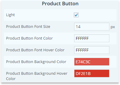
Product Button
-
Show Product Button.
Select to see product button or not. -
Product Button Text.
You can change the text inside product button -
Product Button Font Size.
Select font size for button text -
Product Button Font Color.
Pick up a color for product button text -
Product Button Font Hover Color.
Pick up color for product button text while hove a mouse on it -
Product Button Background Color.
Pick up color for product button background -
Product Button Background Hover Color
Pick up color for product button background while hove a mouse on it

Main Image
-
Main Image Width.
Set width level for main images of the products within catalog. -
Main Image Height.
Set height level for main image of the products within catalog

Title
-
Title Font Size.
Choose size for title -
Title Font Color.
Select title color

Description
-
Description
Select to show the description of the catalog or not -
Description Font Size.
Choose size of description -
Description Font Color.
Choose color for description font

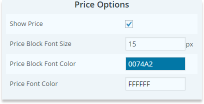
Price Options
-
Show Price.
Select to demonstrate the price for the products -
Price Text.
Change the name of price block -
Price Block Font Size.
Select font size of the price and discount price -
Price Block Font Color.
Pick up a color on price text and discount price font

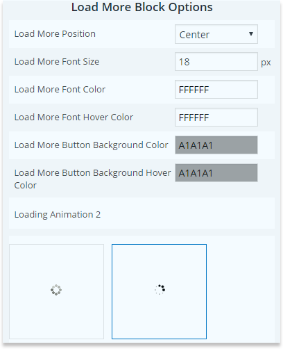
Load More Block Options
-
Load More Position.
Set the preferable position for load more icon -
Load More Font Size.
Change font size of the load more button text -
Load More Font Color.
Change the color of the button text -
Load More Font Hover Color.
Change the color of the text when you hover a mouse on it -
Load More Button Color.
Background color of the button -
Load More Background Hover Color.
Background color when a mouse hovered on it -
Loading Animation
Pick up one animation type

Product Search Options
-
Search Form position.
Select the search position among Left, Right, Center -
Search Form Width.
Decide the level of the width of the search form -
Search Form Border Radius.
This section is prepared to write your desired border radius number -
Search Form Border Color.
Select among unusual colors for the search form border -
Search Form Border Width.
This section is prepared to write your desired border width number -
Search Button Background.
Select one of the colors for the search button background -
Search Button Background Hover.
Choose which color to show when hover over the search button background -
Search Button Text Color.
Decide the color of the search button text

Pagination Block Options
-
Pagination Font Size.
Select your desired font size for the Catalog Pagination -
Pagination Font Color.
Choose your pagination font color of the Catalog Plugin -
Pagination Icons Size.
Here you can write the size which suits the best for the pagination icon -
Pagination Icons Color.
Select one of the amazing colors for the pagination icon -
Pagination Position.
Select where to show your the pagination among three positions

Full-Height Blocks
View Types
-
Allow Lightbox.
Tick to activate viewing images with lightbox -
Allow Zooming.
Tick to activate zoom for images

Element Styles
-
Block Width.
Select width size for element -
Element Background Color.
Pick up color for element background -
Element Border Width.
Write some width number and you can have element border -
Element Border Color.
Pick up color for border on element -
Show Separator Lines.
Tick to see or don't see separation lines.

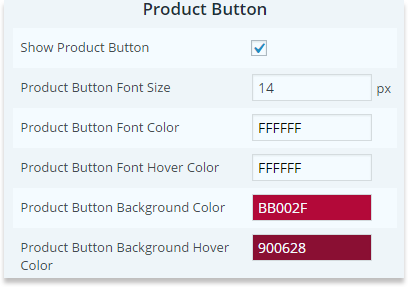
Product Button
-
Show Product Button.
Tick to see product button or not -
Product Button Text.
You can Amend the text in product button -
Product Button Font Size.
Elect font size on button text -
Product Button Font Color.
Take color on product button text -
Product Button Font Hover Color.
Take on product button text while hove a mouse on it -
Product Button Background Color.
Take color on product button background -
Product Button Background Hover Color.
Take color on product button background when you hover a mouse
Title
-
Title Font Size.
Choose size for title -
Title Font Color.
Pick up title color

Thumbnails
-
Show Thumbnails.
Select to see additional images or not -
Thumbnails Position.
Choose where to display additional images -
Thumbnails Width.
Give width size for additional images -
Thumbnails Height.
Give height size for additional images

Description
-
Show Description.
Tick to show the description of the catalog or not -
Description Font Size.
Choose size of description -
Choose size of description
Take color for description font

Price Block Options
-
Show Price.
Tick to demonstrate the price for the products -
Price Text.
Amend the name of price block -
Price Block Font Size.
Select font size of the price and discount price -
Price Block Font Color.
Take color for price and discount price font

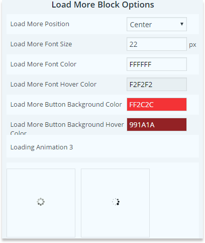
Load More Block Options
-
Load More Position.
Set the preferable position for load more icon -
Load More Font Size.
Change font size of the load more button text -
Load More Font Color.
Change the color of the button text -
Load More Font Hover Color.
Change the color of the text when you hover a mouse on it -
Load More Button Color.
Background color of the button -
Load More Background Hover Color.
Background color when a mouse hovered on it -
Loading Animation.
Pick up one animation type
Product Search Options
-
Search Form position.
Select the search position among Left, Right, Center -
Search Form Width.
Decide the level of the width of the search form -
Search Form Border Radius.
This section is prepared to write your desired border radius number -
Search Form Border Color.
Select among unusual colors for the search form border -
Search Form Border Width.
This section is prepared to write your desired border width number -
Search Button Background.
Select one of the colors for the search button background -
Search Button Background Hover.
Choose which color to show when hover over the search button background -
Search Button Text Color.
Decide the color of the search button text

Pagination Block Options
-
Pagination Font Size.
Select your desired font size for the Catalog Pagination -
Pagination Font Color.
Choose your pagination font color of the Catalog Plugin -
Pagination Icons Size.
Here you can write the size which suits the best for the pagination icon -
Pagination Icons Color.
Select one of the amazing colors for the pagination icon -
Pagination Position.
Select where to show your the pagination among three positions
Catalog / Content Popup
View Types

Element Styles
-
Element Width.
Choose width size for elements of the product in catalog -
Element Height.
Choose height for elements of the products in catalog -
Element Background Color.
Select color for element background -
Element Border Width.
Write some width number and you can have border on element -
Element Border Color.
Choose color for border on element -
Element's Image Overlay Color.
Choose color for element overlay -
Element's Image Overlay Transparency.
Adjust transparency level for element overlay -
Zoom Image Style.
Choose white or black zoom icon

Element Product Button
-
Show Product Button On Element.
Select to have “view product†button on element -
Product Button Font Size.
Choose font size of button text -
Product Button Font Color.
Choose font color of button text -
Product Button Background Color.
Choose color for product button background

Popup Title
-
Element Title Font Size.
Choose size for title in popup -
Element Title Font Color.
Select title color in popup

Popup Description
-
Show Description.
Tick this option on and you can see description text in popup -
Description Font Size.
Adjust size of the description text -
Description Font Color.
Pick up a color for description text in popup

Price Block Options
-
Show Price.
Select to demonstrate the price for the products in catalog -
Price Text.
Change the name of price block -
Price Block Font Size.
Choose font size of the price and discount price -
Price Block Font Color.
Choose color for price and discount price font

Element Title
-
Element Title Font Size.
Choose size for title on element -
Element Title Font Color.
Select title color on the element

Popup Styles
-
Popup Image Full Width.
Choose to stretch the image within popup, or have natural size of it -
Popup Background Color.
Select background color for popup of the product -
Popup Overlay Color.
Choose the color of backend overla while popup is opened -
Popup Overlay Transparency.
Adjust transparency level for background overlay -
Popup Close Button Style.
Choose light or Dark button in popup -
Show Separator Lines.
Select to show separator lines between texts in popup

Popup Thumbnails
-
Show Thumbnails.
Select to see additional images in popup or not -
Thumbnails Position.
Choose where to display additional images in popup -
Thumbnails Width.
Give width size for additional images in popup -
Thumbnails Height.
Give height size for additional images in popup

Popup Product Button
-
Show Product Buttons.
Select to see product button in popup or not -
Product Button Text.
You can change the text inside product button -
Product Button Font Size.
Select font size for button text -
Product Button Font Color.
Choose color for product button text -
Product Button Font Hover Color.
Choose color for product button text while hove a mouse on it. -
Product Button Background Color.
Choose color for product button background -
Product Button Background Hover Color.
Choose color for product button background while hove a mouse on it

Load More Block Options
-
Load More Position.
Set the preferable position for load more icon -
Load More Font Size.
Change font size of the load more button text -
Load More Font Color.
Change the color of the button text -
Load More Font Hover Color.
Change the color of the text when you hover a mouse on it -
Load More Button Color.
Background color of the button -
Load More Background Hover Color.
Background color when a mouse hovered on it -
Loading Animation.
Pick up one animation type
Product Search Options
-
Search Form position.
Select the search position among Left, Right, Center -
Search Form Width.
Decide the level of the width of the search form -
Search Form Border Radius.
This section is prepared to write your desired border radius number -
Search Form Border Color.
Select among unusual colors for the search form border -
Search Form Border Width.
This section is prepared to write your desired border width number -
Search Button Background.
Select one of the colors for the search button background -
Search Button Background Hover.
Choose which color to show when hover over the search button background -
Search Button Text Color.
Decide the color of the search button text

Pagination Block Options
-
Pagination Font Size.
Select your desired font size for the Catalog Pagination -
Pagination Font Color.
Choose your pagination font color of the Catalog Plugin -
Pagination Icons Size.
Here you can write the size which suits the best for the pagination icon -
Pagination Icons Color.
Select one of the amazing colors for the pagination icon -
Pagination Position.
Select where to show your the pagination among three positions

Full-Width Blocks
View Types
-
Allow Lightbox.
Tick to activate viewing images with lightbox -
Allow Zooming.
Tick to activate zoom for images

Element Styles
-
Block Width.
Here select width size for element -
Element Background Color.
Pick up color for element background -
Element Border Width.
Decide some width number and you can have element border -
Element Border Color.
Decide color for border on element -
Show Separator Lines.
Select in order to see or don't see separation lines

Product Button
-
Show Product Button.
Tick to see product button or not -
Product Button Text.
You can Amend the text in product button -
Product Button Font Size.
Elect font size on button text -
Product Button Font Color.
Take color on product button text -
Product Button Font Hover Color.
Take on product button text while hove a mouse on it -
Product Button Background Color.
Take color on product button background -
Product Button Background Hover Color.
Take color on product button background when you hover a mouse
Thumbnails
-
Show Thumbnails.
Select to see additional images or not -
Thumbnails Position.
Choose where to display additional images -
Thumbnails Width.
Give width size for additional images -
Thumbnails Height.
Give height size for additional images

Price Block Options
-
Show Price.
Select to make the price for the products visible in catalog -
Price Text.
Recall the price block -
Price Block Font Size.
Configure price and discount price font size -
Price Block Font Color.
Configure price and discount price font color

Load More Block Options
-
Load More Position.
Set the preferable position for load more icon -
Load More Font Size.
Change font size of the load more button text -
Load More Font Color.
Change the color of the button text -
Load More Font Hover Color.
change the color of the text when you hover a mouse on it -
Load More Button Color.
Background color of the button -
Load More Background Hover Color.
Background color when a mouse hovered on it -
Loading Animation.
Pick up one animation type

Product Search Options
-
Search Form position.
Select the search position among Left, Right, Center -
Search Form Width.
Decide the level of the width of the search form -
Search Form Border Radius.
This section is prepared to write your desired border radius number -
Search Form Border Color.
Select among unusual colors for the search form border -
Search Form Border Width.
This section is prepared to write your desired border width number -
Search Button Background.
Select one of the colors for the search button background -
Search Button Background Hover.
Choose which color to show when hover over the search button background -
Search Button Text Color.
Decide the color of the search button text

Pagination Block Options
-
Pagination Font Size.
Select your desired font size for the Catalog Pagination -
Pagination Font Color.
Choose your pagination font color of the Catalog Plugin -
Pagination Icons Size.
Here you can write the size which suits the best for the pagination icon -
Pagination Icons Color.
Select one of the amazing colors for the pagination icon -
Pagination Position.
Select where to show your the pagination among three positions

Content Slider
View Types
-
Allow Lightbox.
Select to enable viewing images with lightbox -
Allow Zooming.
Select to enable zooming on images

Images
-
Main Image Width.
Decide the width of the main image -
Show Thumbs.
Enable or disable thumbnails under main image -
Thumbs Width.
Configure the width of thumbnail images -
Thumbs Height.
Define the height of thumbnail images

Product Button
-
Show Product Button.
Select to see product button or not. -
Product Button Text.
You can change the text inside product button -
Product Button Font Size.
Select font size for button text -
Product Button Font Color.
Pick up a color for product button text -
Product Button Font Hover Color.
Pick up color for product button text while hove a mouse on it -
Product Button Background Color.
Pick up color for product button background -
Product Button Background Hover Color
Pick up color for product button background while hove a mouse on it

Slider
-
Slider Background Color.
Choose color for content background -
Icons Style.
Choose dark or with arrows on slider -
Show Separator Lines.
Select to see separator lines between texts

Title
-
Title Font Size.
Choose size for title -
Title Font Color.
Select title color

Description
-
Description
Select to show the description of the catalog or not -
Description Font Size.
Choose size of description -
Description Font Color.
Choose color for description font

Price Options
-
Show Price.
Select to demonstrate the price for the products -
Price Text.
Change the name of price block -
Price Block Font Size.
Select font size of the price and discount price -
Price Block Font Color.
Pick up a color on price text and discount price font
Products Options
Image Options
-
Allow Lightbox.
Select to have lightbox feature on images or not -
Allow Zooming.
Select to have zooming feature on images or no -
Main Image Width.
Choose width size for main image -
Show Thumbnails.
Select to see the thumbnail images with main one -
Thumbnails Width.
Choose width size for thumbnail images -
Thumbnails Height.
Choose height size for thumbnail images

Comments Box Options
-
Show Comments.
Select to see comments or not -
Commentator Name Color.
Choose color for commentator name -
Comment Text Color.
Choose color for comment text -
Comment Box Background Color.
Choose color for comments' container -
Submit Button Text.
Change the text on "submit" button -
Submit Button Text Size.
Decide text size for "submit" button text -
Submit Button Text Color.
Choose color for “submit†text -
Submit Button Text Hover Color.
Choose other color for "submit" button text while hover a mouse on it -
Submit Button Background Color.
Choose color for "submit" button background -
Submit Button Background Hover Color.
Choose other color for "submit" button background while hover a mouse on it

Product Options
-
Product Block Background Color.
Choose color for product block background -
Title Font Size.
Decide font size for product title -
Title Font Color.
Decide font color for title -
Show Price.
Select to show the price or not -
Price Font Size.
Give size to price text -
Price Font Color.
Choose color for price text -
Show Description.
Select to show description or not -
Description Font Size.
Decide font size for description text -
Description Font Color.
Choose color for description text -
Show Rating.
Select to show rating for the product or not -
Show Share Buttons.
Select to show share buttons or not -
Rating's / Share Button's Label Font Size.
Choose font size for rating/share buttons label -
Rating's / Share Button's Label Font Color.
Choose font color for rating/share buttons label -
Show Separator Lines.
Select t see separator lines in product box between texts

Tabs Options
-
Tabs Titles Font Color.
Choose color for text in tabs -
Tabs Titles Font Hover Color.
Choose color for text in tabs while hover mouse on it -
Tabs Border Color.
Choose tab's border color

Parameters Box Options
-
Show Parameters.
Select to see parameters tab -
Parameter Name Color.
Choose color for parameters name -
Parameter Value Color.
Choose color for parameters value

Contact Seller Popup Styles
-
Popup Background Gradient.
Select two colors for the gradient on popup -
Popup Title.
Add some title to popup -
Popup Title Font Size.
Decide font size for the title -
Popup Title Color.
Decide color of the font -
Close Button Style.
Choose one of the close button styles -
Text Field Border Size.
Change border size of the form fields border -
Text Field Border Color.
Decide color for the button border -
Submit Button Text Size.
Change text size on "submit" button -
Submit Button Text Color.
Change text color on "submit" button -
Submit Button Background Color.
Change background color of "submit" button -
Submit Button Background Hover Color.
Change color of the "submit" button while hover a mouse over it

Contact Seller Button Styles
-
Show Contact Seller Button.
Click to enable or disable "contact seller" button -
Button Text Size.
Change text size on"contact seller" button -
Button Text Color.
Change text color on "contact seller" button -
Button Text Hover Color.
Change text color on "contact seller" button while hover a mouse over it -
Button Background Color.
Change background color of "contact seller" button -
Button Background Hover Color.
Change color of the "contact seller" button while hover a mouse over it

Image View Options
Lightbox Options
Internationalization
Lightbox style.
Pick up one of designed styles of ligtboxTransition type.
Choose the effect of lightbox performanceOpening speed.
From here, configure speed of opening for lightboxClosing speed.
Configure the speed of closing for lightboxShow the title.
Tick to display the title of image.Overlay transparency.
In opened position of lightbox, you can adjust the background overlay transparency levelAuto open.
Tick for automatically opening the first image after reloadingOverlay close.
Tick to close the lightbox by clicking on the background overlayESC close.
Tick to close the image with esc button on keyboard.Keyboard navigation.
Tick to slide images in lightbox with left and right buttons.Loop content.
Selection of this option can allow to get to the first image after last imageShow close button.
Choose to display close button or notSlideshow Positioning
Fixed position.
Tick to fix the ligtbox position while scrolling the pagePopup position.
You are given 9 ways to posit the ligtbox within pageDimensions
Popup size fix.
Selection of this options will fix the popup width and heightPopup height.
Give the height size to the lightboxPopup width.
Give width size to the lightboxPopup max width.
In case of size - unfixed, choose image max widthPopup max height.
In case of size - unfixed, choose image max heightPopup initial height.
Decide the inceptive height of openingPopup initial width.
Decide the inceptive width of openingSlideshow
Slideshow.
Tick to enable slideshowSlideshow interval.
Decide period between slidesSlideshow auto start.
Selection of this option will start slideshow automatically as you open a lightbox. Also there will be "play" and "stop" button for slideshowSlideshow start button text.
Enter some new text on start buttonSlideshow stop button text.
Enter some new text of stop buttonZoom Options
Zoom Window Options
Window.
Window type of zoom iconZoom Window Width.
Give width size for zoom windowZoom Window Height.
Give height size for zoom windowX-Asis Offset.
Choose the position of window by x-asisY-Asis Offset.
Choose position of window by y-asisZoom Window Position.
Zoom window position by sidesZoom Window Border Size.
Give border to zoom window and decide the size of itZoom Window Border Color.
Pick up color for zoom window borderZoom Window Border Radius.
Set the radius level of window cornersAllow Zoom On Thumbnails.
Select to allow zooming the thumbnail images Tint OptionsEnable Tint.
Select to have transparent overlay out of zoom window Tint Colour. Choose a color for tint overlayTint Opacity.
Choose transparency level for overlay,which is out of zoom windowTint FadeIn Speed.
Set fade-in speed for tintTint FadeOut Speed.
Set fade-out speed for tintLens Options
Lens Fade In Speed.
Set fade-in speed for lens overlayLens Fade Out Speed.
Set fade-out speed for lens overlayZoom Lens.
Select to have zoom lensLens Shape.
Choose lens type Lens Color. Choose color overlay inside zoom lensLens Opacity.
Choose opacity level for overlay inside zoom lensCursor.
The default cursor is usually the arrow, then set the cursor is a pointer and cross iconEasing.
Select for smoothly movement in lens view.Lens Size Fix.
Select to fix the size of the lensLens Zoom Scroll.
Select to be able to scroll the zoomInner. Inner type of zoom icon
Lens Options
Inner Fade In Speed.
Set fade-in speed for lens overlayInner Fade Out Speed.
Set fade-out speed for lens overlayCursor.
The default cursor is usually the arrow, then set the cursor is a pointer and cross iconEasing.
Select for smoothly movement in lens view.Lens Zoom Scroll.
Select to be able to scroll the zoomLens. Lens type of zoom icon
Lens Options
Lens Fade In Speed.
Set fade-in speed for lens overlayLens Fade Out Speed.
Set fade-out speed for lens overlayZoom Lens.
Select to have zoom lenLens Shape.
Choose lens type Lens Color. Choose color overlay inside zoom lensLens Opacity.
Choose opacity level for overlay inside zoom lensCursor.
The default cursor is usually the arrow, then set the cursor is a pointer and cross iconEasing.
Select for smoothly movement in lens view.Lens Size Fix.
Select to fix the size of the lensLens Zoom Scroll.
Select to be able to scroll the zoom