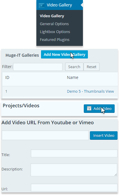
Adding Video-Gallery
Huge-IT Video Gallery > Add New Video Gallery
-
Add video link
Video links can be added from Youtube and Vimeo.
-
Set Custom Thumbnail
You can add your desired thumbnail image on the video.
-
Title
Right a title to the video.
-
Description
Right some information about video content.
-
URL
You can add a link to another page that you want the click to land on.
-
View Counter
This Button shows the number of video views, hover on it to download the report in pdf file.
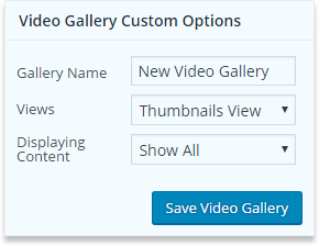
After you created Video Gallery on the right side you can find 3 blocks.
-
Video Gallery Custom Options
From this block you can make a number of custom changes with the gallery you work on.
-
Gallery name
Title your gallery.
-
Select View
Choose one among 7 different gallery types.
-
Displaying Content
Choose whether to show all vidoes on one page, or divide them using Pagination or “load more†button.
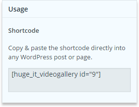
Inserting Created Image Gallery
Usage
The shortcode of your Video Gallery is located here. By Copying and Patsing this shortcode you can insert the gallery wherever you need in your post. It is also possible to add the shortcode automatically. On post window just pressing on add video gallery button the shortcode will be inserted into the post.
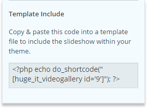
Template Include
Insert this code into your template to make the inserting of the video gallery easy in custom location within your theme.
General Options of Video Gallery
In this section you can modify your Video Gallery in more details. That will change the features of each view you choose.
Video Gallery/Content popup
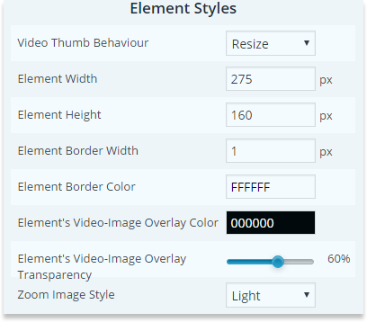
Video-element Styles
-
Video Video-element Width
Specify preferable width of your videos.
-
Video-element Height
Specify desired height of posted videos.
-
Video-element Border Width
Specify preferable width for surrounding border of the video-element.
-
Video-element Border color
Select preferable color for surrounding border.
-
Video-element's Video-image Overlay color
Select a color for the overlay on the video as you hold the mouse arrow on it.
-
Video-element's Video-image Overlay Opacity
Determine preferable transparency degree for the video overlay.
-
Zoom image Style
Determine black or white color for zoom icon.
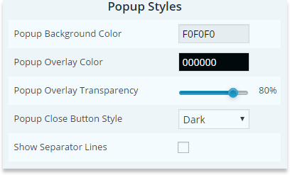
Popup Styles
-
Popup Background color
Edit to set preferable background color of popup in your gallery.
-
Popup Overlay color
Choose preferable color for popup overlay.
-
Popup Overlay Opacity
Specify preferable degree of background transparency of overlay color.
-
Popup Close Button Style
Edit what color for “X†icon would you like.
-
Show Separator Lines
Select to show separation lines between title and text in popup.
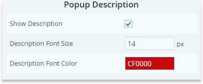
Popup Description
-
Show Description
Select to show the description of the video.
-
Description Font Size
Determine preferable size of description font.
-
Description Font color
Set preferable color of description text.
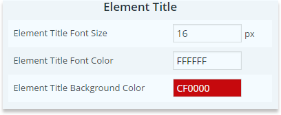
Video-element Title
-
Video-element Title Font Size
Edit preferable size of title font.
-
Video-element Title Font color
Edit preferable color of title.
-
Video-element Title Background color
Determine preferable color of title’s background.
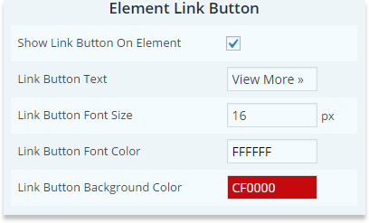
Video-element Link button
-
Show Link button on Video-element
Select to show “View More†button on the video.
-
Link button Text
You can change the “View More†button text.
-
Link button Font Size
Choose preferable size of Link-button.
-
Link button Font color
Determine preferable color of link font.
-
Link button Background color
Determine preferable color for link background.
Popup Title
-
Popup Title Font Size
Determine title size of the letters of popup.
-
Popup Title Font color
Configure preferable color for title in popup.

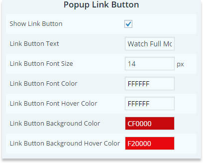
Popup Link button
-
Show Link button
Choose to make Link-button visible in popup.
-
Link button Text
Edit the text of Link-button in popup.
-
Link button Font Size
Set preferable size of the letters of Link-button in popup.
-
Link button Font color
Configure the preferable color for Link-button in popup.
-
Link button Font Hover color
Determine preferable color of Link-button when you hover the mouse on it.
-
Link button Background color
Specify preferable background color of the Link-button in popup.
-
Link button Background Hover color
Specify preferable background color of the link as you hover the mouse on it.
Content video slider
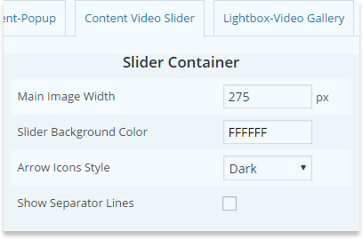
Slider Container
-
Main image Width
This fixes the margin of the main image.
-
Slider Background color
You can choose preferable color for slider field.
-
Arrow Icons Style
Specify black/white color of arrows in slider.
-
Show Separator Lines
Choose to make the lines between text, title, and link visible.
Title
-
Title Font Size
Configure the preferable size of the letters of the title.
-
Title Font color
Configure the preferable color of the font.

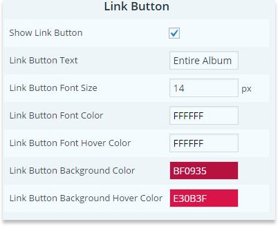
Link button
-
Show Link button
Click to show the Link-button.
-
Link button Text
Write a text on link button.
-
Link button Font Size
Edit the size of the letters of the link text.
-
Link button Font color
Edit the color of the link text.
-
Link button Font Hover color
Link button Font Hover color.
-
Link button Background color
Determine preferable color for link field
-
Link button Background Hover color
Choose a color for your link background when hovering on it.
Description
-
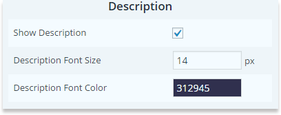
Show Description
Click to show the description of the text.
-
Description Font Size
Specify preferable size of the letters of description.
-
Description Font color
Choose a color for description text in your “content video slider†view.
Lightbox-Video Gallery
Video-image
-
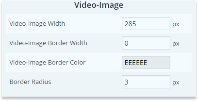
Video-image Width
Specify preferable size of the video.
-
Video-image Border Width
Specify preferable width of surrounded borders.
-
Video-image Border color
Configure your preferable color for border.
-
Border Radius
Determine prefered radius of border corners.
Title
-
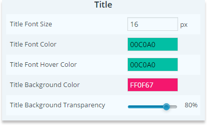
Title Font Size
Specify the size for font of the title.
-
Title Font color
Configure the preferable color for title.
-
Title Font Hover color
Configure the preferable color of the title while hovering on it.
-
Title Background color
Set the background color for the title.
-
Title Background Opacity
Set level for title background transparency.
Video Slider
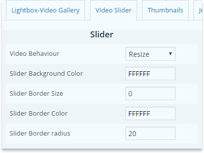
Slider
-
Video Behaviour
Choose “resized†to stretch and fit your videos to the size of the Slider.
-
Slider Background color
Set preferable color of the vacant part of slider field while images has its natural size.
-
Slideshow Border Size
Specify the size of the border in your slider.
-
Slideshow Border color
Choose your prefered color for border.
-
Slideshow Border radius
Determine preferable radius for slider border.
Navigation
-
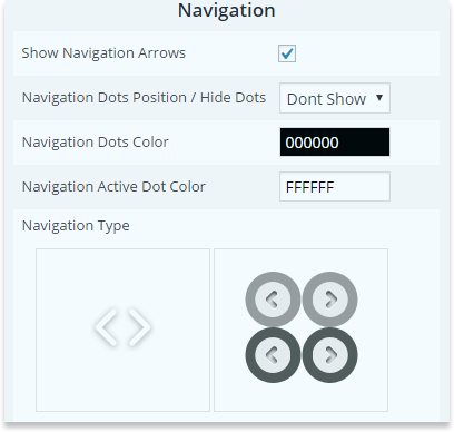
Show Navigation Arrows
Click to show navigation arrows in slider.
-
Navigation Dots Position/Hide Dots
Choose where to locate the dots, or choose to remove them.
-
Navigation Dots color
Choose the color for navigation dots of slider.
-
Navigation Active Dot color
Determine preferable color of moving dots in slider.
-
Navigation Type
Determine preferable type of your navigation arrows.
Thumbnails
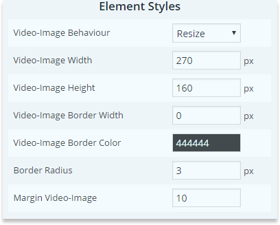
Element Styles
-
Image Behavior
Natural mode will cut the image to fix element box without resizing the image.
-
Element Width
Sets the width of posted video.
-
Element Height
Sets the height of posted video.
-
Element Border Width
Set the border width of the element,
-
Element Border Color
Choose the color for the border.
-
Element's Image Overlay Color
Choose a color for the overlay on the video while hovering on it.
-
Element's Image Overlay Opacity
Set the level of transparency of the video overlay.
-
Zoom Image Style
Changes the color of zoom icon.
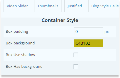
Container Style
-
Presence of a background
Click to have background for thumbnails.
-
Box background color
Specify desired color of surrounding box.
-
Box shadow
Click if you like to have shadows of the box.
-
Box padding
Specify desired distance between box and video.
Title
-
Title Font Size
Specify preferable size of the text font.
-
Title Font color
Determine preferable color of text.
-
Overlay Background color
Determine the overlay color of the title.
-
Title Background Opacity
Specify the degree of background transparency.
-
Link text
Right desired text for the link.
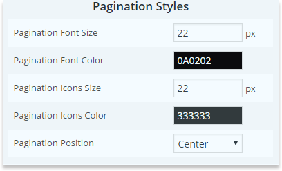
Pagination Styles
-
Pagination Font Size
Change the size of the pagination numbers.
-
Pagination Font Color
Font color of the pagination can be changed.
-
Pagination Icons Size
Next/prev icon size change from here.
-
Pagination Icons Color
Change next/prev icon colors.
-
Pagination Position
Decide where to posit pagination.

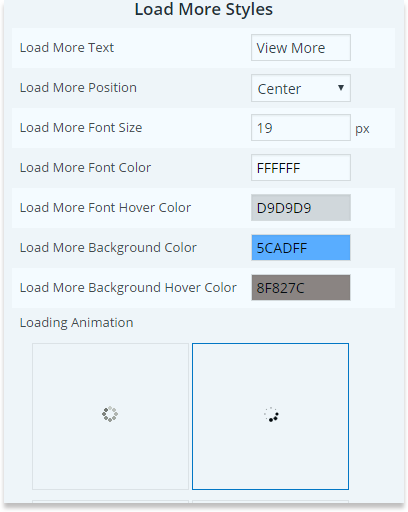
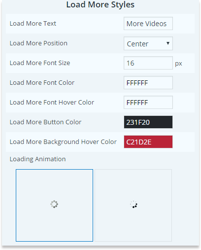
Load More Styles
-
Load More Text
Write another text in Load More button.
-
Load More Position
Decide where to posit the button.
-
Load More Font Size
Change font size of the button text.
-
Load More Font Color
Change the color of the button text.
-
Load More Font Hover Color
Change the color of the text when you hover a mouse on it.
-
Load More Button Color
Background color of the button.
-
Load More Background Hover Color
Background color when a mouse hovered on it.
-
Loading Animation
Change the animation type of the loading.
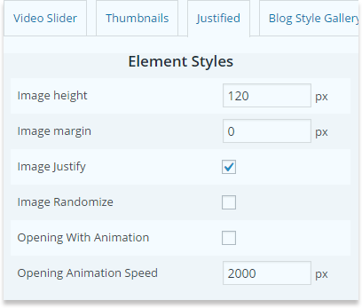
Justified View
Element Styles
-
Image height
Set the height of the ideos.
-
Image margin
Set the distance between each video in the tape.
-
Image Justify
Select to make the width of all videos up to 100% in container. So all of them together will fit the container of your theme, and tick off to bring each of them with its natural size.
-
Image Randomize
Select to show your images randomly.
-
Opening With Animation
Choose to see the tape of videos appearing animated.
-
Opening Animation Speed
Select the speed of the animation.
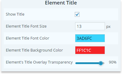
Element Title
-
Show Title
Choose to show the title or not
-
Element Title Font Size
Choose the font size for the title of the video.
-
Element Title Font Color
Select preferable color for the title of the video.
-
Element Title Background Color
Choose the color of title background.
-
Element’s Title Overlay Opacity
Select the level of transparency for the title overlay.
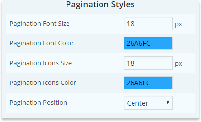
Pagination Styles
-
Pagination Font Size
Change the size of the pagination numbers.
-
Pagination Font Color
Font color of the pagination can be changed.
-
Pagination Icons Size
Next/prev icon size change from here.
-
Pagination Icons Color
Change next/prev icon colors.
-
Pagination Position
Decide where to posit pagination.
Load More Styles
-
Load More Text
Write another text in Load More button.
-
Load More Position
Decide where to posit the button.
-
Load More Font Size
Change font size of the button text.
-
Load More Font Color
Change the color of the button text.
-
Load More Font Hover Color
Change the color of the text when you hover a mouse on it.
-
Load More Button Color
Background color of the button.
-
Load More Background Hover Color
Background color when a mouse hovered on it.
-
Loading Animation
Change the animation type of the loading.

Blog Styles Gallery
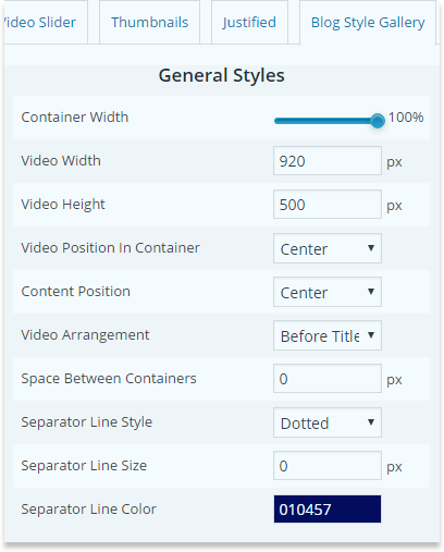
General Styles
-
Container Width
Choose whole gallery item container width
-
Video Width
Choose video player width.
-
Video Height
Choose video player height.
-
Video Position
Decide where to place the video.
-
Content Position
Set content position within page container.
-
Video Arrangement
Decide where to place the video among description and title.
-
Space Between Containers
Set padding level between each item container.
-
Separator Line Style
Pick up one style for separational line, which will divide your gallery items.
-
Separator Line Size
Anjust separational line size.
-
Separator Line Color
Choose a color for separational line.
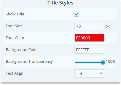
Title Styles
-
Show Title
Select, if you need to display the title of the project.
-
Font Size
Choose title font size.
-
Font Color
Decide font color for the title.
-
Background Color
Title has background, pick up a color for it.
-
Background Opacity
Adjust title background Transparency level.
-
Text Align
Choose text align for title.
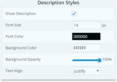
Description Styles
-
Show Description
Select whether to see the description text or not.
-
Font Size.
Change the font size for the description.
-
Font Color
Pick up font color for description text.
-
Background Color
Change color for description background.
-
Background Opacity
Adjust description background transparency level.
-
Text Align
Choose the text align for description.
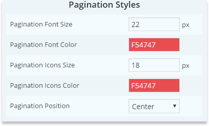
Pagination Styles
-
Pagination Font Size
Change the size of the pagination numbers.
-
Pagination Font Color
Font color of the pagination can be changed.
-
Pagination Icons Size
Next/prev icon size change from here.
-
Pagination Icons Color
Change next/prev icon colors.
-
Pagination Position
Decide where to posit pagination.
Load More Styles
-
Load More Text
Write another text in Load More button.
-
Load More Position
Decide where to posit the button.
-
Load More Font Size
Change font size of the button text.
-
Load More Font Color
Change the color of the button text.
-
Load More Font Hover Color
Change the color of the text when you hover a mouse on it.
-
Load More Button Color
Background color of the button.
-
Load More Background Hover Color
Background color when a mouse hovered on it.
-
Loading Animation
Change the animation type of the loading.
