


Creating Slider
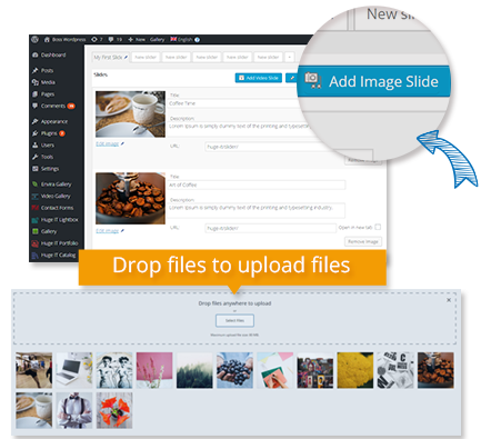
After you activate Huge-IT Slider plugin it should appear on the left panel of WordPress dashboard. Click on it go in Slider>Add New Slider. Click on "Add Image Slider". Using Standard Media Uploader option you should select the images you want to add to your slider. You can add images as one by one and using multi selection, add several images at once. Each image should be filled with information individually from our admin page.
Let's have a look at the individual features of the images.
-
Title.
Here you can provide a title for the slider image. -
Description.
Provide the details for the image. This will be visible on a transparent layer on the slider. Description text can be constructed using HTML. -
URL.
This is an optional feature. You can provide a link on the slider to take to specific location on your website or another website. The URL should be provided in http:// form. next to it you can select "open in new tab" option.
Creating Video Slider
Click on "Add Video slide", this will open a window with "Add Video URL From Youtube or Vimeo" filed, where you should insert the link of the video from that two sources. After video is inserted you will see a few configuration options and your video slider is ready.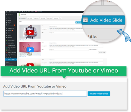
Creating Post Slider
Click on "Add post slide" you will see a window which allows you to add post slider using 2 different ways. One is manual way, called "Static Posts". Clicking on it you will see a list of your post, which you can select. Second way is "Last Posts", here you just select how many posts it should grab, from which category, some slightly adjustments and it's ready. Note: each post should have featured image in order to be seen in slider. It is not recommended to use post slider mixed with simple slider.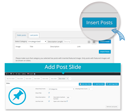
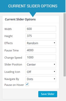
Current Slider Options
These options are available in free version, and allows you to make individual adjustments on each slider. You can find them straight on the right panel of slider admin page.
-
Width.
Specify the width of the slider in pixels. It has maximal limit - slider will not be larger than your theme container size. -
Height.
Specify the height of the slider in pixels.It has maximal limit - slider will not be larger than your theme container size. -
Effects.
Select the effect which will be applied to the slider. -
Pause time.
Specify the pause time for the slider in milliseconds. -
Change speed.
Specify the change speed in milliseconds. -
Slider Position.
Choose where to posit the slider within your fixed container. -
Loading Icon.
This option is important. If your site jQuery loading time is slower that it should be, slider may have slightly movement, which you should cover using loading icon. -
Navigate By.
Decide how to navigate slider. It has three ways: using dots, thumbnail images, or no navigation at all. -
Pause on Hover.
Choose whether to pause the slider on mouse or leave it changing to the further image.
Editing Slider General Options
To change the styles and colors of the slider you should got to Huge IT Slider> Slider Options.Image styles and colors
-
Image Behavior .
Choose natural to show images in their natural size. In this case your slider will have background. -
Slider background Color .
Select the background color for the image. The color will be visible with during the slide change within specific effects. -
Slider Border Size .
Add border on the top and bottom of the slider. -
Slider Border Color .
Paint the border with the new color. -
Slider Border radius .
Configure border radius. -
Slider Loading Image .
While loading icon option is ON, you can choose a style for it.
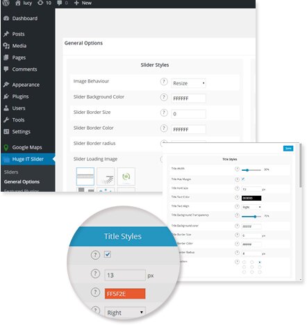
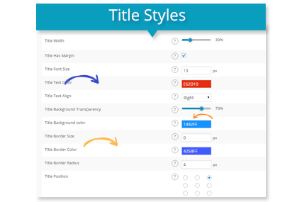
Title styles and colors
-
Title Color.
Set the color for the title. -
Title background color.
Choose the color for the cell containing the title. -
Title font size.
Specify the font size for the image title. -
Title border size.
Set the border for the title. -
Title border color.
Select the border for the title. -
Title border radius.
Set the border radius for the title. -
Title position.
Define the position of the title using the view graph.
Description styles and colors
-
Description Color.
Set the color for the image description. -
Description background color.
Choose the color for the cell containing the image description. -
Description font size.
Specify the font size for the image description. -
Description border size.
Specify the border for the image description. -
Description border color.
Select the border color for the image description. -
Description border radius.
Set the border radius for the image description cell. -
Description position.
Select the positioning of the description. Please make sure it does not coincide with the title position avoiding overloading.

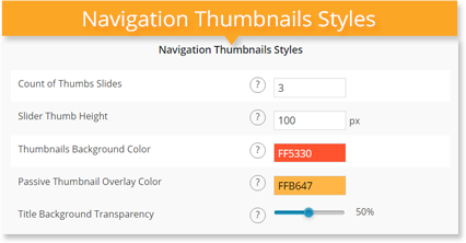
Navigation Thumbnails Styles
-
Count of Thumbs Slides.
Select how many thumbnail images you want to see under slider as navigation. -
Slider Thumb Height.
Choose height for the thumbnails of the slider. -
Thumbnails Background Color.
If images has different proportions. they have background and you may adjust it's color. -
Passive Thumbnail Overlay Color.
Those thumbnails which are passive have overlay, which you can change in color. -
Passive Thumbnail Overlay Transparency.
Thumbnail overlay may be changed in transparency level.
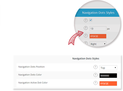
Navigation styles and colors
-
Navigation Dots position.
Set the position for the navigation arrows. -
Navigation Dots Color.
Select the dot color for the navigation. -
Navigation Active Dot Color.
Specify the color for the dot for the currently displayed image. -
Show Navigation Arrows.
Select to see navigation arrows on slider. -
Navigation Arrows Style.
Choose navigation arrow style among 16 different types.
Inserting the Slider
Inserting the Slider into the Post or Page.
You should use the automatically generated code into the Post or Page. The shortcode takes the following form: [huge_it_slider id=N] , where N is the number ID of the created Slider.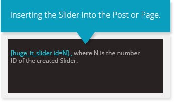
Inserting the Slider into the template.
The shortcode can be easily inserted into a template/theme which corresponds to the WordPress standards. To do so you should insert the following shortcode: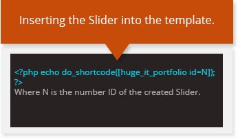
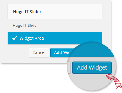
Widget integration.
From theme widget list you can find Huge-IT Slider, and may add it as widget.