
Installation of Huge-IT Portfolio Gallery Extension
To install portfolio gallery go to: Extensions > extensions manager > choose the zip file > upload and install

Use of Portfolio Gallery Module
Module of this extension is made to facilitate the process of using the plugin within the page. You can place it in different positions within the page, choose in which pages to display or not.

How to install module zip file
Extensions > Module Manager > Activate Huge-IT Portfolio Gallery > Choose gallery from the list and the Position within specific theme (on right panel) > Menu assignment > Choose where you need to display it

Inserting the Portfolio Gallery Extension
Menu > Main Menu > Selected or new menu item > Select > Huge-IT Portfolio Gallery > Save

Creating Portfolio gallery
Components > Portfolio Gallery > New.
Portfolio Gallery extension gives you 7 different views to demonstrate your portfolios:
-
Gallery/Content-Popup
-
Content Slider
-
Full-Width block
-
Full-Height block
-
Lightbox Gallery
-
Toggle Up/Down
-
FAQ toggle up/down
-
Image Portfolio Gallery
Add main images, add additional images.
-
Video Portfolio Gallery
If you have videos, add main videos and additional videos. Videos can be added from Youtube and Vimeo sources only.
-
Title
Write title to each project.
-
Description
Make it full with description text.
-
URL
Add external URL link, which will work on “View More†button.
-
Sorting buttons
Select to “show sorting buttons†and enable the function of sorting your projects by date, name, and so on.
-
Category Buttons
Select to “show category buttons†and enable the ability to divide your projects into different categories.
You can create new categories or edit the existing ones, and select to which category your project should belong to. You can place the shortcodes of portfolios in article/page/template.

General Options of Portfolio
This section will allow you to make changes for the specific view option of the Portfolio. Here you can change styling, color and other options. The relevant changes will affect all portfolio using that specific view option.
Blocks Toggle Up/Down
Element Styles
-
Element Background Color
Determine the background color for the element.
-
Element Border Width
Set the border width for the element.
-
Element Border Color
Select the element border color.
-
Toggle Button Style
Choose the style for the toggle button.
-
Show Separator Lines
Choose whether to display divider lines or not.

Sorting Styles
-
Sort Button Font Size
With this option you are able to set the size of the sorting button for the Portfolio gallery.
-
Sort Button Font Color
Among the colors select your desired color for the portfolio gallery sorting button.
-
Sort Button Font Hover Color
Select one of the colors for the letters when you hover over the sorting button.
-
Sort Button Background Color
Set one of the colors for the Portfolio Gallery sort button background.
-
Sort Button Background Hover Color
Portfolio Gallery allows you to use color for the sort button when you hover over it.
-
Sort Button Border Radius
Select Sort Button radius size.
-
Sort Button Padding
Choose the distance among the Sort Buttons
-
Sort block Position
There are 3 ways to show the Sort Button that is Top, Right and Left.
-
Sort By Default Button Name
Change the Default button name.
-
Sorting By Date Button Name
Change the Date button name.
-
Sorting By Title Button Name
Change the Title button name.
-
Random Sorting Button Name
Change the Random button name.
-
Ascending Sorting Button Name
Change the Ascending button name.
-
Descending Sorting Button Name
Change the Descending button name.

Main Image
-
Main Image Width
Set the main image width in pixels.
-
Main Image Height
Set the main image height in pixels.

Title
-
Title Font Size
Specify the font size for the portfolio title.
-
Title Font Color
Choose the color for the portfolio title font.

Thumbnails
-
Show Thumbnails
Choose whether to display the image thumbnails or not.
-
Thumbnails Position
Set the positioning of the thumbnails.
-
Thumbnails Width
Set the width for the image thumbnails.

Description
-
Show Description
Choose whether to display the description of the portfolio or not.
-
Description Font Size
Set the portfolio description font size in pixels.
-
Description Font Color
Select the portfolio description font color.

Link Button
-
Show Link Button
Choose whether to display Show More button.
-
Link Button Text
Define the text of the Show More button.
-
Link Button Font Size
Set the font size for the Show More button.
-
Link Button Font Color
Select the font color for the Show More button.
-
Link Button Font Hover Color
Select the font color for the Show More button when hovered.
-
Link Button Background Color
Select the background color for the Show More button.
-
Link Button Background Hover Color
Select the background color for the Show More button when hovered.

Category styles
-
Show All Category Button Name
Choose whether to change the All name or not in the portfolio Gallery.
-
Filter Button Font Size
Select the size for the filter button size.
-
Filter Button Font Color
Select the color for the filter button font.
-
Filter Button Font Hover Color
Set one of the amazing colors for the font when hover over the category button.
-
Filter Button Background Color
Set a color for the category button in Portfolio Gallery.
-
Filter Button Background Hover Color
Choose one of the colors for the background color when hover over the Filter Button.
-
Filter Button Border Radius
Set a border radius for Filter Button.
-
Filter Button Padding
Set padding among the Filter Button.
-
Filter block Position
Filter Block position is prepared to choose the position to insert on the top, on the left or right.

Pagination Styles
-
Pagination Font Size
Set your desired font size for the Catalog Pagination.
-
Pagination Icons Color
Change the color of the catalog pagination icons.
-
Pagination Font Color
Select one of the amazing colors for the pagination.
-
Pagination Icon Size
Set your desired size for the pagination icon.
-
Pagination Position
Select one of the preferable position for the pagination: Left, Right, Center.

Load More Styles
-
Load More Text
Write your preferable text for the load more icon.
-
Load More Position
Set the preferable position for load more icon.
-
Load More Font Size
Change font size of the load more button text.
-
Load More Font Color
Change the color of the button text.
-
Load More Font Hover Color
Change the color of the text when you hover a mouse on it.
-
Load More Button Color
Background color of the button.
-
Load More Background Hover Color
Background color when a mouse hovered on it.

Full-Height Blocks
Element Styles
-
Block Width
Set the width of the blocks in pixels.
-
Element Background Color
Determine the background color for the element.
-
Element Border Width
Set the border width for the element.
-
Element Border Color
Select the element border color.
-
Show Separator Lines
Choose whether to display divider lines or not.

Title
-
Title Font Size
Specify the font size for the portfolio title.
-
Title Font Color
Choose the color for the portfolio title font.

Thumbnails
-
Show Thumbnails
Choose whether to display the image thumbnails or not.
-
Thumbnails Position
Set the positioning of the thumbnails.
-
Thumbnails Width
Set the width for the image thumbnails.

Description
-
Show Description
Choose whether to display the description of the portfolio or not.
-
Description Font Size
Set the portfolio description font size in pixels.
-
Description Font Color
Select the portfolio description font color.

Link Button
-
Show Link Button
Choose whether to display Show More button.
-
Link Button Text
Define the text of the Show More button.
-
Link Button Font Size
Set the font size for the Show More button.
-
Link Button Font Color
Select the font color for the Show More button.
-
Link Button Font Hover Color
Select the font color for the Show More button when hovered.
-
Link Button Background Color
Select the background color for the Show More button.
-
Link Button Background Hover Color
Select the background color for the Show More button when hovered.

Category styles
-
Show All Category Button Name
Choose whether to change the All name or not in the portfolio Gallery.
-
Filter Button Font Size
Select the size for the filter button size.
-
Filter Button Font Color
Select the color for the filter button font.
-
Filter Button Font Hover Color
Set one of the amazing colors for the font when hover over the category button.
-
Filter Button Background Color
Set a color for the category button in Portfolio Gallery.
-
Filter Button Background Hover Color
Choose one of the colors for the background color when hover over the Filter Button.
-
Filter Button Border Radius
Set a border radius for Filter Button.
-
Filter Button Padding
Set padding among the Filter Button.
-
Filter block Position
Filter Block position is prepared to choose the position to insert on the top, on the left or right.

Sorting Styles
-
Sort Button Font Size
With this option you are able to set the size of the sorting button for the Portfolio gallery.
-
Sort Button Font Color
Among the colors select your desired color for the portfolio gallery sorting button.
-
Sort Button Font Hover Color
Select one of the colors for the letters when you hover over the sorting button.
-
Sort Button Background Color
Set one of the colors for the Portfolio Gallery sort button background.
-
Sort Button Background Hover Color
Portfolio Gallery allows you to use color for the sort button when you hover over it.
-
Sort Button Border Radius
Select Sort Button radius size.
-
Sort Button Padding.
Choose the distance among the Sort Button.
-
Sort block Position.
There are 3 ways to show the Sort Button that is Top, Right and Left.
-
Sort By Default Button Name
Change the Default button name.
-
Sorting By Date Button Name
Change the Date button name.
-
Sorting By Title Button Name
Change the Title button name.
-
Random Sorting Button Name
Change the Random button name.
-
Ascending Sorting Button Name
Change the Ascending button name.
-
Descending Sorting Button Name
Change the Descending button name.

Pagination Styles
-
Pagination Font Size
Set your desired font size for the Catalog Pagination.
-
Pagination Icons Color
Change the color of the catalog pagination icons.
-
Pagination Font Color
Select one of the amazing colors for the pagination.
-
Pagination Icon Size
Set your desired size for the pagination icon.
-
Pagination Position
Select one of the preferable position for the pagination: Left, Right, Center.
Load More Styles
-
Load More Text
Write your preferable text for the load more icon.
-
Load More Position
Set the preferable position for load more icon.
-
Load More Font Size
Change font size of the load more button text.
-
Load More Font Color
Change the color of the button text.
-
Load More Font Hover Color
Change the color of the text when you hover a mouse on it.
-
Load More Button Color
Background color of the button.
-
Load More Background Hover Color
Background color when a mouse hovered on it.
Gallery/Content Popup
Element Styles
-
Element Width
Set the element width in pixels.
-
Element Height
Set the element height in pixels
-
Element Background Color
Determine the background color for the element.
-
Element Border Width
Set the border width for the element.
-
Element Border Color
Select the element border color.
-
Element’s Image Overlay Color
Set the overlay color for the element image.
-
Element’s Image Overlay Transparency
Determine the transparency level of the overlay.
-
Zoom Image Style
Choose the light or dark options of the image zoom.

Sorting Styles
-
Sort Button Font Size
With this option you are able to set the size of the sorting button for the Portfolio gallery.
-
Sort Button Font Color
Among the colors select your desired color for the portfolio gallery sorting button.
-
Sort Button Font Hover Color
Select one of the colors for the letters when you hover over the sorting button.
-
Sort Button Background Color
Set one of the colors for the Portfolio Gallery sort button background.
-
Sort Button Background Hover Color
Portfolio Gallery allows you to use color for the sort button when you hover over it.
-
Sort Button Border Radius
Select Sort Button radius size.
-
Sort Button Padding
Choose the distance among the Sort Button.
-
Sort block Position
There are 3 ways to show the Sort Button that is Top, Right and Left.
-
Sort By Default Button Name
Change the Default button name.
-
Sorting By Date Button Name
Change the Date button name.
-
Sorting By Title Button Name
Change the Title button name.
-
Random Sorting Button Name
Change the Random button name.
-
Ascending Sorting Button Name
Change the Ascending button name.
-
Descending Sorting Button Name
Change the Descending button name.

Category styles
-
Show All Category Button Name
Choose whether to change the All name or not in the portfolio Gallery.
-
Filter Button Font Size
Select the size for the filter button size.
-
Filter Button Font Color
Select the color for the filter button font.
-
Filter Button Font Hover Color
Set one of the amazing colors for the font when hover over the category button.
-
Filter Button Background Color
Set a color for the category button in Portfolio Gallery.
-
Filter Button Background Hover Color
Choose one of the colors for the background color when hover over the Filter Button.
-
Filter Button Border Radius
Set a border radius for Filter Button.
-
Filter Button Padding
Set padding among the Filter Button.
-
Filter block Position
Filter Block position is prepared to choose the position to insert on the top, on the left or right.

Element Title
-
Element Title Font Size
Specify the font size for the element title.
-
Element Title Font Color
Choose the color for the element title font.

Element Link Button
-
Show Link Button On Element
Choose whether to display Show More button on the element or not.
-
Link Button Text
Set the text for the Show More button.
-
Link Button Font Size
Define the font size for the text over the button.
-
Link Button Font Color
Select the font color for the text over the button.
-
Link Button Background Color
Select the background color for the text over the button.

Popup Styles
-
Popup Background Color
Select the popup background color.
-
Popup Overlay Color
Set the overlay color for the background.
-
Popup Overlay Transparency
Set the level of transparency of the popup overlay.
-
Popup Close Button Style
Select the style of the Close button for the background.
-
Show Separator Lines
Choose whether to display divider lines or not.

Popup Title
-
Popup Title Font Size
Specify the font size for the popup title.
-
Popup Title Font Color
Choose the color for the popup title font.

Popup Thumbnails
-
Show Thumbnails
Choose whether to display the image thumbnails or not.
-
Thumbnails Position
Set the positioning of the thumbnails.
-
Thumbnails Width
Set the width for the image thumbnails.

Popup Description
-
Show Description
Choose whether to display the description of the portfolio or not.
-
Description Font Size
Set the portfolio description font size in pixels.
-
Description Font Color
Select the portfolio description font color.

Popup Link Button
-
Show Link Button
Choose whether to display Show More button.
-
Link Button Text
Define the text of the Show More button.
-
Link Button Font Size
Set the font size for the Show More button.
-
Link Button Font Color
Select the font color for the Show More button.
-
Link Button Font Hover Color
Select the font color for the Show More button when hovered.
-
Link Button Background Color
Select the background color for the Show More button.
-
Link Button Background Hover Color
Select the background color for the Show More button when hovered.

Pagination Styles
-
Pagination Font Size
Set your desired font size for the Catalog Pagination.
-
Pagination Icons Color
Change the color of the catalog pagination icons.
-
Pagination Font Color
Select one of the amazing colors for the pagination.
-
Pagination Icon Size
Set your desired size for the pagination icon.
-
Pagination Position
Select one of the preferable position for the pagination: Left, Right, Center.
Load More Styles
-
Load More Text
Write your preferable text for the load more icon.
-
Load More Position
Set the preferable position for load more icon.
-
Load More Font Size
Change font size of the load more button text.
-
Load More Font Color
Change the color of the button text.
-
Load More Font Hover Color
Change the color of the text when you hover a mouse on it.
-
Load More Button Color
Background color of the button.
-
Load More Background Hover Color
Background color when a mouse hovered on it.
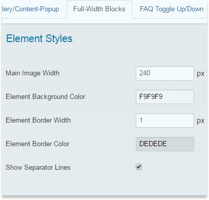
Full-Width Blocks
Elements Styles
-
Main Image Width
Set the width of the main image.
-
Element Background Color
Determine the background color for the element.
-
Element Border Width
Set the border width of the element.
-
Element Border Color
Select the element border color.
-
Show Separator Lines
Choose whether to display divider lines or not.
Sorting Styles
-
Sort Button Font Size
With this option you are able to set the size of the sorting button for the Portfolio gallery.
-
Sort Button Font Color
Among the colors select your desired color for the portfolio gallery sorting button.
-
Sort Button Font Hover Color
Select one of the colors for the letters when you hover over the sorting button.
-
Sort Button Background Color
Set one of the colors for the Portfolio Gallery sort button background.
-
Sort Button Background Hover Color
Portfolio Gallery allows you to use color for the sort button when you hover over it.
-
Sort Button Border Radius
Select Sort Button radius size.
-
Sort Button Padding
Choose the distance among the Sort Button.
-
Sort block Position
There are 3 ways to show the Sort Button that is Top, Right and Left.
-
Sort By Default Button Name
Change the Default button name.
-
Sorting By Date Button Name
Change the Date button name.
-
Sorting By Title Button Name
Change the Title button name.
-
Random Sorting Button Name
Change the Random button name.
-
Ascending Sorting Button Name
Change the Ascending button name.
-
Descending Sorting Button Name
Change the Descending button name.

Category styles
-
Show All Category Button Name
Choose whether to change the All name or not in the portfolio Gallery.
-
Filter Button Font Size
Select the size for the filter button size.
-
Filter Button Font Color
Select the color for the filter button font.
-
Filter Button Font Hover Color
Set one of the amazing colors for the font when hover over the category button.
-
Filter Button Background Color
Set a color for the category button in Portfolio Gallery.
-
Filter Button Background Hover Color
Choose one of the colors for the background color when hover over the Filter Button.
-
Filter Button Border Radius
Set a border radius for Filter Button.
-
Filter Button Padding
Set padding among the Filter Button.
-
Filter block Position
Filter Block position is prepared to choose the position to insert on the top, on the left or right.

Title
-
Title Font Size
Specify the font size for the portfolio title.
-
Title Font Color
Choose the color for the portfolio title font.

Thumbnails
-
Show Thumbnails
Choose whether to display the image thumbnails or not.
-
Thumbnails Position
Set the positioning of the thumbnails.
-
Thumbnails Width
Set the width for the image thumbnails.

Description
-
Show Description
Choose whether to display the description of the portfolio or not.
-
Description Font Size
Determine the description font size in pixels.
-
Description Font Color
Select the font color for the description.

Link Button
-
Show Link Button
Choose whether to display Show More button.
-
Link Button Text
Define the text of the Show More button.
-
Link Button Font Size
Set the font size for the Show More button.
-
Link Button Font Color
Select the font color for the Show More button.
-
Link Button Font Hover Color
Select the font color for the Show More button when hovered.
-
Link Button Background Color
Select the background color for the Show More button.
-
Link Button Background Hover Color
Select the background color for the Show More button when hovered.

Pagination Styles
-
Pagination Font Size
Set your desired font size for the Catalog Pagination.
-
Pagination Icons Color
Change the color of the catalog pagination icons.
-
Pagination Font Color
Select one of the amazing colors for the pagination.
-
Pagination Icon Size
Set your desired size for the pagination icon.
-
Pagination Position
Select one of the preferable position for the pagination: Left, Right, Center.
Load More Styles
-
Load More Text
Write your preferable text for the load more icon.
-
Load More Position
Set the preferable position for load more icon.
-
Load More Font Size
Change font size of the load more button text.
-
Load More Font Color
Change the color of the button text.
-
Load More Font Hover Color
Change the color of the text when you hover a mouse on it.
-
Load More Button Color
Background color of the button.
-
Load More Background Hover Color
Background color when a mouse hovered on it.
FAQ
First Shown Block
-
Block Width
Set the width for the block in pixels.
-
Block Background Color
Select the background.
-
Block Border Width
Set the border width in pixels.
-
Block Border Color
Choose the border color.

Title
-
Title Font Size
Specify the font size for the portfolio title.
-
Title Font Color
Choose the color for the portfolio title font.
-
Toggle Button Style
Select the toggle button style from the provided options.

Description
-
Show Description
Choose whether to display the description of the portfolio or not.
-
Description Font Size
Set the portfolio description font size in pixels.
-
Description Font Color
Select the portfolio description font color.

Link Button
-
Show Link Button
Choose whether to display Show More button.
-
Link Button Text
Define the text of the Show More button.
-
Link Button Font Size
Set the font size for the Show More button.
-
Link Button Font Color
Select the font color for the Show More button.
-
Link Button Font Hover Color
Select the font color for the Show More button when hovered.
-
Link Button Background Color
Select the background color for the Show More button.
-
Link Button Background Hover Color
Select the background color for the Show More button when hovered.

Sorting Styles
-
Sort Button Font Size
With this option you are able to set the size of the sorting button for the Portfolio gallery.
-
Sort Button Font Color
Among the colors select your desired color for the portfolio gallery sorting button.
-
Sort Button Font Hover Color
Select one of the colors for the letters when you hover over the sorting button.
-
Sort Button Background Color
Set one of the colors for the Portfolio Gallery sort button background.
-
Sort Button Background Hover Color
Portfolio Gallery allows you to use color for the sort button when you hover over it.
-
Sort Button Border Radius
Select Sort Button radius size.
-
Sort Button Padding
Choose the distance among the Sort Button.
-
Sort block Position
There are 3 ways to show the Sort Button that is Top, Right and Left.
-
Sort By Default Button Name
Change the Default button name.
-
Sorting By Date Button Name
Change the Date button name.
-
Sorting By Title Button Name
Change the Title button name.
-
Random Sorting Button Name
Change the Random button name.
-
Ascending Sorting Button Name
Change the Ascending button name.
-
Descending Sorting Button Name
Change the Descending button name.

Category styles
-
Show All Category Button Name
Choose whether to change the All name or not in the portfolio Gallery.
-
Filter Button Font Size
Select the size for the filter button size.
-
Filter Button Font Color
Select the color for the filter button font.
-
Filter Button Font Hover Color
Set one of the amazing colors for the font when hover over the category button.
-
Filter Button Background Color
Set a color for the category button in Portfolio Gallery.
-
Filter Button Background Hover Color
Choose one of the colors for the background color when hover over the Filter Button.
-
Filter Button Border Radius
Set a border radius for Filter Button.
-
Filter Button Padding
Set padding among the Filter Button.
-
Filter block Position
Filter Block position is prepared to choose the position to insert on the top, on the left or right.

Pagination Styles
-
Pagination Font Size
Set your desired font size for the Catalog Pagination.
-
Pagination Icons Color
Change the color of the catalog pagination icons.
-
Pagination Font Color
Select one of the amazing colors for the pagination.
-
Pagination Icon Size
Set your desired size for the pagination icon.
-
Pagination Position
Select one of the preferable position for the pagination: Left, Right, Center.
Load More Styles
-
Load More Text
Write your preferable text for the load more icon.
-
Load More Position
Set the preferable position for load more icon.
-
Load More Font Size
Change font size of the load more button text.
-
Load More Font Color
Change the color of the button text.
-
Load More Font Hover Color
Change the color of the text when you hover a mouse on it.
-
Load More Button Color
Background color of the button.
-
Load More Background Hover Color
Background color when a mouse hovered on it.
Content Slider
Slider
-
Slider Background Color
Choose the background color for the slider.
-
Slider Tabs Font Color
Set the font color for the slider tabs.
-
Slider Tabs Background Color
Set the background color for the slider tabs.
-
Icons Style
Choose the icon style.

Images
-
Main Image Width
Set the main image width in pixels.
-
Main Image Height
Set the main image height in pixels.

Title
-
Title Font Size
Specify the font size for the portfolio title.
-
Title Font Color
Choose the color for the portfolio title font.

Link Button
-
Show Link Button
Choose whether to display Show More button.
-
Link Button Text
Define the text of the Show More button.
-
Link Button Font Size
Set the font size for the Show More button.
-
Link Button Font Color
Select the font color for the Show More button.
-
Link Button Font Hover Color
Select the font color for the Show More button when hovered.
-
Link Button Background Color
Select the background color for the Show More button.
-
Link Button Background Hover Color
Select the background color for the Show More button when hovered.

Lightbox Gallery
Image
-
Image Width
Set the image width in pixels.
-
Image Border Width
Set the image border width in pixels.
-
Image Border Color
Select the image border color.
-
Border Radius
Set the border radius in pixels.

Sorting Styles
-
Sort Button Font Size
With this option you are able to set the size of the sorting button for the Portfolio gallery.
-
Sort Button Font Color
Among the colors select your desired color for the portfolio gallery sorting button.
-
Sort Button Font Hover Color
Select one of the colors for the letters when you hover over the sorting button.
-
Sort Button Background Color
Set one of the colors for the Portfolio Gallery sort button background.
-
Sort Button Background Hover Color
Portfolio Gallery allows you to use color for the sort button when you hover over it.
-
Sort Button Border Radius
Select Sort Button radius size.
-
Sort Button Padding
Choose the distance among the Sort Button.
-
Sort block Position
There are 3 ways to show the Sort Button that is Top, Right and Left.
-
Sort By Default Button Name
Change the Default button name.
-
Sorting By Date Button Name
Change the Date button name.
-
Sorting By Title Button Name
Change the Title button name.
-
Random Sorting Button Name
Change the Random button name.
-
Ascending Sorting Button Name
Change the Ascending button name.
-
Descending Sorting Button Name
Change the Descending button name.

Category styles
-
Show All Category Button Name
Choose whether to change the All name or not in the portfolio Gallery.
-
Filter Button Font Size
Select the size for the filter button size.
-
Filter Button Font Color
Select the color for the filter button font.
-
Filter Button Font Hover Color
Set one of the amazing colors for the font when hover over the category button.
-
Filter Button Background Color
Set a color for the category button in Portfolio Gallery.
-
Filter Button Background Hover Color
Choose one of the colors for the background color when hover over the Filter Button.
-
Filter Button Border Radius
Set a border radius for Filter Button.
-
Filter Button Padding
Set padding among the Filter Button.
-
Filter block Position
Filter Block position is prepared to choose the position to insert on the top, on the left or right.

Title
-
Title Font Size
Specify the font size for the portfolio title.
-
Title Font Color
Choose the color for the portfolio title font.
-
Title Font Hover Color
Choose the color for the portfolio title font when hovered.
-
Title Background Color
Set a background color for the title.
-
Title Background Transparency
Determine the title background transparency level.

Pagination Styles
-
Pagination Font Size
Set your desired font size for the Catalog Pagination.
-
Pagination Icons Color
Change the color of the catalog pagination icons.
-
Pagination Font Color
Select one of the amazing colors for the pagination.
-
Pagination Icon Size
Set your desired size for the pagination icon.
-
Pagination Position
Select one of the preferable position for the pagination: Left, Right, Center.
Load More Styles
-
Load More Text
Write your preferable text for the load more icon.
-
Load More Position
Set the preferable position for load more icon.
-
Load More Font Size
Change font size of the load more button text.
-
Load More Font Color
Change the color of the button text.
-
Load More Font Hover Color
Change the color of the text when you hover a mouse on it.
-
Load More Button Color
Background color of the button.
-
Load More Background Hover Color
Background color when a mouse hovered on it.
Lightbox Options
This section will allow to make changes of the Lightbox’s settings. Most of the view options allow styling and multi coloring.
Internationalization
-
Lightbox style
Choose the style of your popup.
-
Transition type
Set the way of opening the popup.
-
Opening speed
Set the speed of opening the popup in milliseconds.
-
Closing speed
Set the speed of closing the popup in milliseconds.
-
Show the title
Choose whether to display the content title.
-
Overlay transparency
Change the level of popup background transparency.
-
Auto open
Choose for automatically opening the firs content after reloading.
-
Overlay close
Choose to close the content by clicking on the overlay.
-
ESC close
Choose to close the content with esc button.
-
Keyboard navigation
Set to change the images with left and right buttons.
-
Loop content
If “true†give the ability to move from the last image to the first image while navigation.
-
Show close button
Choose whether to display close button.

Positioning
-
Fix position
If “true†the popup does not change its position while scrolling up or down.
-
Popup position
Set the position of popup.

Dimensions
-
Popup size fix
Choose to fix the popup width and height.
-
Popup max width
Set unfix content max width.
-
Popup max height
Set unfix max height.
-
Popup initial height
Set the initial height of opening.
-
Popup initial width
Set the initial size of opening.

Slideshow
-
Slideshow
Select to enable slideshow.
-
Slideshow interval
Set the time between each slide.
-
Slide show auto start
If “true†it works automatically.
-
Slideshow start button text
Set the text on start button.
-
Slideshow stop button text
Set the text of stop button.
