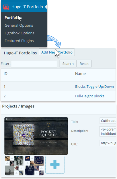
Use the standard WordPress Image uploader to add an image presing Add Project/Image button.
Provide a title for the portfolio set.
Provide a description for the portfolio set.
Provide the link to be opened when hitting the image. In additon you can make the image to open in a separate window checking the box.
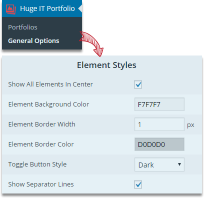
This section will allow making changes for the specific view option of the Portfolio. Most of the view options allow styling and color options. The relevant changes will affect all portfolio using that specific view option.
Determine the background color for the element.
Set the border width for the element.
Select the element border color.
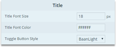
Choose the style for the toggle button.
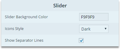
Choose whether to display divider lines or not.
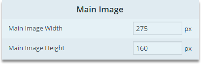
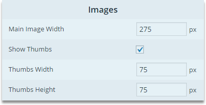
Set the main image width in pixels.
Set the main image height in pixels.
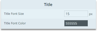
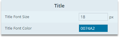
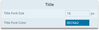
Specify the font size for the portfolio title.
Choose the color for the portfolio title font.
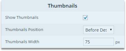
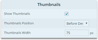
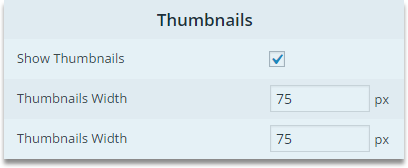
Choose whether to display the image thumbnails or not.
Set the positioning of the thumbnails.
Set the width for the image thumbnails.
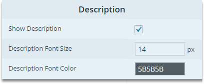
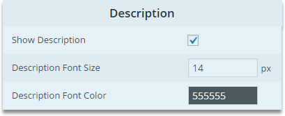
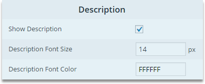
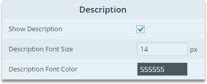
Choose whether to display the description of the portfolio or not.
Set the portfolio description font size in pixels.
Select the portfolio description font color.
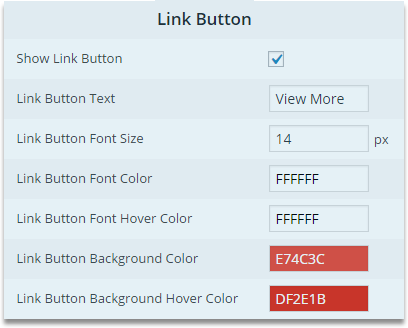
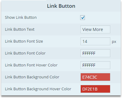
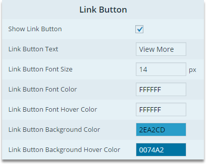
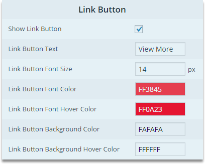
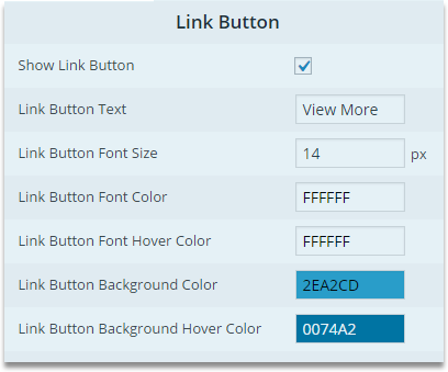
Choose whether to display Show More button.
Define the text of the Show More button.
Set the font size for the Show More button.
Select the font color for the Show More button.
Select the font color for the Show More button when hovered.
Select the background color for the Show More button.
Select the background color for the Show More button when hovered.
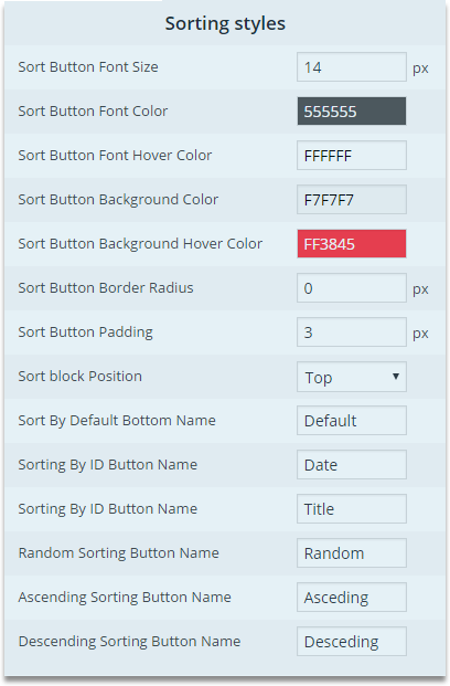
With this option you are able to set the size of the sorting button for the Portfolio gallery
Among the colors select your desired color for the portfolio gallery sorting button
Select one of the colors for the letters when you hover over the sorting button
Set one of the colors for the Portfolio Gallery sort button background
Portfolio Gallery allows you to use color for the sort button when you hover over it
Select Sort Button radius size
Choose the distance among the Sort Button
There are 3 ways to show the Sort Button that is Top, Right and Left
Change the Default button name
Change the Date button name
Change the Time button name
Change the Random button name
Change the Ascending button name
Change the Descending button name
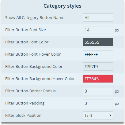
Choose whether to change the All name or not in the portfolio Gallery
Select the size for the filter button size
Select the color for the filter button font
Set one of the amazing colors for the font when hover over the category button
Set a color for the category button in Portfolio Gallery
Choose one of the colors for the background color when hover over the Filter Button
Set a border radius for Filter Button
Set padding among the Filter Button
Filter Block position is prepared to choose the position to insert on the top, on the left or right
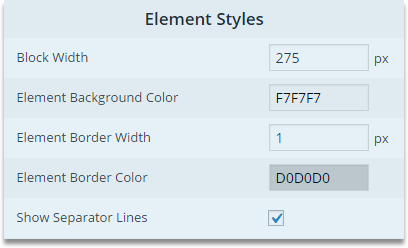
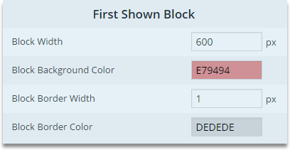
Set the width of the blocks in pixels.
Determine the background color for the element.
Set the border width for the element.
Select the element border color.
Choose whether to display divider lines or not.
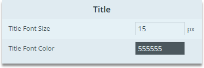
Specify the font size for the portfolio title.
Choose the color for the portfolio title font.
Choose whether to display image thumbnails or not.
Set the thumbnail position.
Set the thumbnail width in pixels.
Choose whether to display the image descriptions or not.
Determine the font size for the image descriptions.
Choose the font color for the image description.
With this option you are able to set the size of the sorting button for the Portfolio gallery
Among the colors select your desired color for the portfolio gallery sorting button
Select one of the colors for the letters when you hover over the sorting button
Set one of the colors for the Portfolio Gallery sort button background
Portfolio Gallery allows you to use color for the sort button when you hover over it
Select Sort Button radius size
Choose the distance among the Sort Button
There are 3 ways to show the Sort Button that is Top, Right and Left
Change the Default button name
Change the Date button name
Change the Time button name
Change the Random button name
Change the Ascending button name
Change the Descending button name
Choose whether to change the All name or not in the portfolio Gallery
Select the size for the filter button size
Select the color for the filter button font
Set one of the amazing colors for the font when hover over the category button
Set a color for the category button in Portfolio Gallery
Choose one of the colors for the background color when hover over the Filter Button
Set a border radius for Filter Button
Set padding among the Filter Button
Filter Block position is prepared to choose the position to insert on the top, on the left or right
Choose whether to display Show More button.
Define the text of the Show More button.
Set the font size for the Show More button.
Select the font color for the Show More button.
Select the font color for the Show More button when hovered.
Select the background color for the Show More button.
Select the background color for the Show More button when hovered.
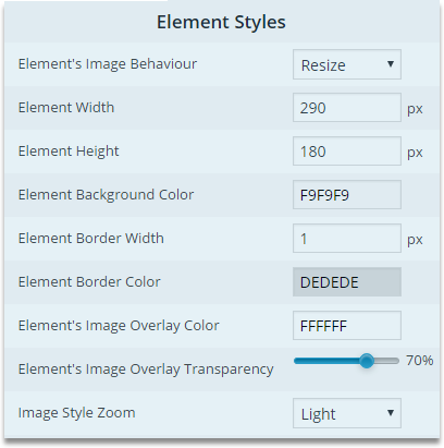
Set the element width in pixels.
Set the element height in pixels.
Determine the background color for the element.
Set the border width for the element.
Select the element border color.
Set the overlay color for the element image.
Determine the transparency level of the overlay.
Choose the light or dark options of the image zoom.
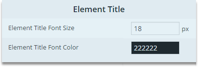
Specify the font size for the element title.
Choose the color for the element title font.
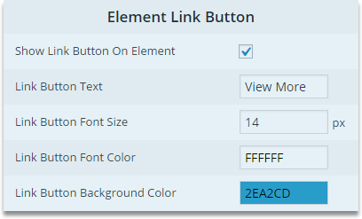
Choose whether to display Show More button on the element or not.
Set the text for the Show More button.
Defin the font size for the text over the button.
Select the font color for the text over the buton.
Select the background color for the text over the button.
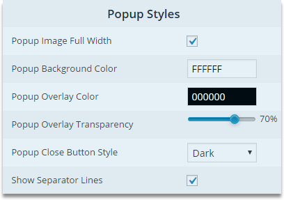
Select the popup background color.
Set the overlay color for the background.
Set the level of transprancy of the popup overlay.
Select the style of the Close button for the background.
Choose whether to display divider lines or not.
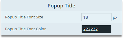
Specify the font size for the popup title.
Choose the color for the popup title font.
Choose whether to display the image thumbnails or not.
Set the positioning of the thumbnails.
Set the width for the image thumbnails.
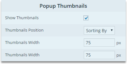
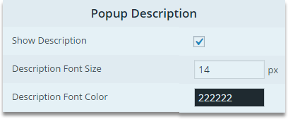
Choose whether to display the description of the portfolio or not.
Set the portfolio description font size in pixels.
Select the portfolio description font color.
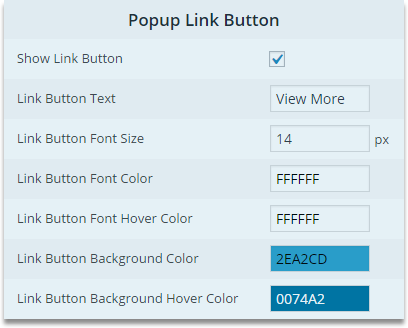
Choose whether to display Show More button.
Define the text of the Show More button.
Set the font size for the Show More button.
Select the font color for the Show More button.
Select the font color for the Show More button when hovered.
Select the background color for the Show More button.
Select the background color for the Show More button when hovered.
With this option you are able to set the size of the sorting button for the Portfolio gallery
Among the colors select your desired color for the portfolio gallery sorting button
Select one of the colors for the letters when you hover over the sorting button
Set one of the colors for the Portfolio Gallery sort button background
Portfolio Gallery allows you to use color for the sort button when you hover over it
Select Sort Button radius size
Choose the distance among the Sort Button
There are 3 ways to show the Sort Button that is Top, Right and Left
Change the Default button name
Change the Date button name
Change the Time button name
Change the Random button name
Change the Ascending button name
Change the Descending button name
Choose whether to change the All name or not in the portfolio Gallery
Select the size for the filter button size
Select the color for the filter button font
Set one of the amazing colors for the font when hover over the category button
Set a color for the category button in Portfolio Gallery
Choose one of the colors for the background color when hover over the Filter Button
Set a border radius for Filter Button
Set padding among the Filter Button
Filter Block position is prepared to choose the position to insert on the top, on the left or right
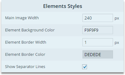
Set the width of the main image.
Determine the background color for the element.
Set the border width of the element.
Select the element border color.
Choose whether to display divider lines or not.
Specify the font size for the portfolio title.
Choose the color for the portfolio title font.
Choose whether to display the image thumbnails or not.
Set the positioning of the thumbnails.
Set the width for the image thumbnails.
Choose whether to display the description of the portfolio or not.
Determine the description font size in pixels.
Select the font color for the description.
Choose whether to display Show More button.
Define the text of the Show More button.
Set the font size for the Show More button.
Select the font color for the Show More button.
Select the font color for the Show More button when hovered.
Select the background color for the Show More button.
Select the background color for the Show More button when hovered.
With this option you are able to set the size of the sorting button for the Portfolio gallery
Among the colors select your desired color for the portfolio gallery sorting button
Select one of the colors for the letters when you hover over the sorting button
Set one of the colors for the Portfolio Gallery sort button background
Portfolio Gallery allows you to use color for the sort button when you hover over it
Select Sort Button radius size
Choose the distance among the Sort Button
There are 3 ways to show the Sort Button that is Top, Right and Left
Change the Default button name
Change the Date button name
Change the Time button name
Change the Random button name
Change the Ascending button name
Change the Descending button name
Choose whether to change the All name or not in the portfolio Gallery
Select the size for the filter button size
Select the color for the filter button font
Set one of the amazing colors for the font when hover over the category button
Set a color for the category button in Portfolio Gallery
Choose one of the colors for the background color when hover over the Filter Button
Set a border radius for Filter Button
Set padding among the Filter Button
Filter Block position is prepared to choose the position to insert on the top, on the left or right
Set the width for the block in pixels.
Select the background
Set the boder width in pixels.
Choose the boder color.
Specify the font size for the portfolio title.
Choose the color for the portfolio title font.
Select the toggle button style from the provided options.
Choose whether to display the description of the portfolio or not.
Set the portfolio description font size in pixels.
Select the portfolio description font color.
With this option you are able to set the size of the sorting button for the Portfolio gallery
Among the colors select your desired color for the portfolio gallery sorting button
Select one of the colors for the letters when you hover over the sorting button
Set one of the colors for the Portfolio Gallery sort button background
Portfolio Gallery allows you to use color for the sort button when you hover over it
Select Sort Button radius size
Choose the distance among the Sort Button
There are 3 ways to show the Sort Button that is Top, Right and Left
Change the Default button name
Change the Date button name
Change the Time button name
Change the Random button name
Change the Ascending button name
Change the Descending button name
Choose whether to change the All name or not in the portfolio Gallery
Select the size for the filter button size
Select the color for the filter button font
Set one of the amazing colors for the font when hover over the category button
Set a color for the category button in Portfolio Gallery
Choose one of the colors for the background color when hover over the Filter Button
Set a border radius for Filter Button
Set padding among the Filter Button
Filter Block position is prepared to choose the position to insert on the top, on the left or right
Choose whether to display Show More button.
Define the text of the Show More button.
Set the font size for the Show More button.
Select the font color for the Show More button.
Select the font color for the Show More button when hovered.
Select the background color for the Show More button.
Select the background color for the Show More button when hovered.
Choose the background color for the slider.
Set the font color for the slider tabs.
Set the background color for the slider tabs.
Choose the icon style.
Set the main image width in pixels.
Set the main image height in pixels.
Choose whether to display the description of the portfolio or not.
Set the portfolio description font size in pixels.
Select the portfolio description font color.
Specify the font size for the portfolio title.
Choose the color for the portfolio title font.
Choose whether to display Show More button.
Define the text of the Show More button.
Set the font size for the Show More button.
Select the font color for the Show More button.
Select the font color for the Show More button when hovered.
Select the background color for the Show More button.
Select the background color for the Show More button when hovered.
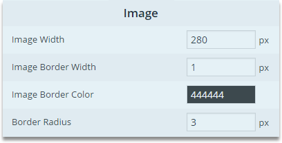
Set the image width in pixels.
Set the image border width in pixels.
Select the image border color.
Set the border radius in pixels.
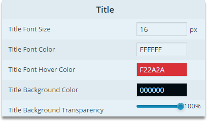
Specify the font size for the portfolio title.
Choose the color for the portfolio title font.
Choose the color for the portfolio title font when hovered.
Set a bacground color fot the title.
Determine the title background transparency level.
With this option you are able to set the size of the sorting button for the Portfolio gallery
Among the colors select your desired color for the portfolio gallery sorting button
Select one of the colors for the letters when you hover over the sorting button
Set one of the colors for the Portfolio Gallery sort button background
Portfolio Gallery allows you to use color for the sort button when you hover over it
Select Sort Button radius size
Choose the distance among the Sort Button
There are 3 ways to show the Sort Button that is Top, Right and Left
Change the Default button name
Change the Date button name
Change the Time button name
Change the Random button name
Change the Ascending button name
Change the Descending button name
Choose whether to change the All name or not in the portfolio Gallery
Select the size for the filter button size
Select the color for the filter button font
Set one of the amazing colors for the font when hover over the category button
Set a color for the category button in Portfolio Gallery
Choose one of the colors for the background color when hover over the Filter Button
Set a border radius for Filter Button
Set padding among the Filter Button
Filter Block position is prepared to choose the position to insert on the top, on the left or right
On the upper right hand you can identify three blocks of options for the portfolio.
This section allows the users to do some interesting customization on the portfolio
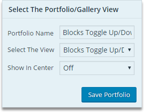
You have a chance to give an interesting names to the portfolio gallery
Select one of the amazing 7 nicely designed views
Choose whether to show the portfolio in center
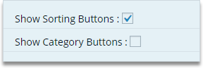
Select to display Sorting Button on the Portfolio gallery
Select to showcase Category Button on the Portfolio gallery
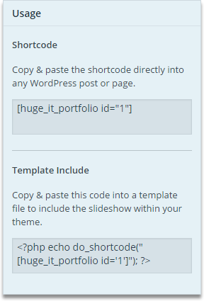
Here you will see the shortcode for the created portfolio. You can add the shortcode to the page or post where you want the images to be displayed. In addition you can find the shortcode icon with each post and page within its TinyMCE editor and can click on it, select the portfolio and insert the shortcode.
If you want to use the portfolio for a custom location with the theme, you can copy and paste the provided code. To do so you should insert the following shorcode: Where N is the number ID of the created Portfolio Gallery.