


How the site looks on different screen resolutions
There is a need to see how the site looks on different laptop screen resolutions . Especially if the site is responsive for mobile devices, i.e. correctly transformed to different screen resolutions. In this article, we will look at several ways in which you can check the site at different screen resolutions.
What could it be useful for?
For example, according to the statistics of your site, you can analyze what screen resolutions and in what percentage your site visitors use:
You can then see how your site appears on devices with these permissions. If you have developed / are developing an adaptive version of the site, after looking at how the site looks in different resolutions, you can discuss some details with the developer.
Also, if your site already uses some specific adaptive template, then you can see how the site looks in different resolutions and decide whether to use this template or look for another one.
How to view the site at different screen resolutions
There are many ways to make your site view in different screen resolutions. So, for example, the main screen resolutions for the site could be viewed in general using simple Windows tools by changing the screen resolution in the Screen settings section :
But, this method is not entirely convenient, and it also makes it possible to see how the site looks only with basic computer screen resolutions.
Checking the site in the browser. Screen resolution
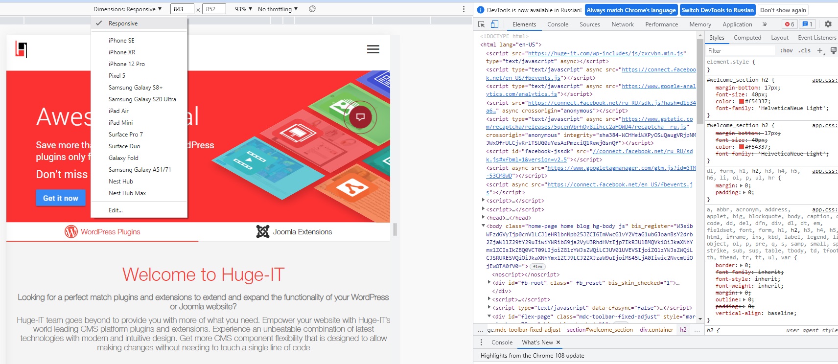
Another way to view the site in different screen resolutions is provided by the built-in capabilities of browsers. For example, in Google Chrome, while on the desired site, right-click and select View Code (or use the keyboard shortcut, as shown in the picture):
An additional panel with site codes appears, where to enable viewing the site in different resolutions, click on a special tab, as shown in the picture below.
To select different mobile devices, use the drop-down menu . The right side also indicates the screen resolutions on the selected device. To expand the screen of the device, use the corresponding button.
A more convenient way to check the site at different screen resolutions is provided by special online services.
View site screen resolution in Screenfly
This is one of the most convenient (at the same time, free) services at the moment, with which you can quickly view the site not only at the main ones, but in general at different screen resolutions!
Go to the Screenfly service . We enter the site to be checked in the proposed field and get the result (I will comment under the picture):
The first tabs allow you to view the site in all major popular screen resolutions. Those. you can see how the site looks when viewed on netbooks or laptops, tablets, mobile phones, TVs.
Additional functions:
- You can manually set a specific screen resolution size
- You can rotate the screen horizontally or vertically
- You can enable scrolling to view the pages of the site up and down.
- You can copy the link to view the current selection. It can be useful if you need to discuss with someone the display of a site with a specific resolution.
Popular Posts
-
WordPress Forms Plugin Integrates PayPal and Google Maps
 05/15/2017
 -

Introducing To WordPress Login Plugin
02/02/2017 -

Importance of ethical behavior in the workplace
06/05/2017 -

Huge-IT News And Updates Of The Week
01/27/2017
Love To Write?

Contribute a guest post and spread creative message for the community.
Contact us at [email protected] and get editor's access!

