Add New Gallery Add Images Use the standard WordPress Image uploader to add an image from media library or upload from computer. Title Add a title to your image. Description Give some information or describe the topic. URL Provide some link of your post. Click to open in new tab or don't click to open in the same tab. OR Add videos Use the standard WordPress video uploader to add a video from Youtube or Vimeo. Just insert a link. Title Add a title to your videos. Description Give some information or describe the topic. URL Provide some link of your post. Click to open in new tab or don't click to open in the same tab. When you finish creating your Image Gallery. Find on the right site 3 blocks: Image Gallery Custom Options From this block you can make a number of custom changes with the gallery you work on. Gallery name Title your gallery. Select View Choose one among 7 different gallery types. Displaying Content Choose where to show all projects on one page, or divide them using Pagination or "load more" button. Images Per Page While choosing pagination or "load more" decide how many items it should show per page. Ratings Enable rating system with like/dislike or heart icon. Inserting Created Image Gallery. Usage Here you can find a shortcode of your Image Gallery. You can Copy and Paste this shortcode wherever you need in your posts or page. Or you can add this code automatically, when posting your Gallery there is a button to add the Gallery, pressing on it the shortcode inserts into your post. Template Include This code is for inserting Gallery into your template, it makes the inserting easier to use in custom location within theme. General Options of Gallery In this section you can modify your Image Gallery in more details. That will change the features of each view you choose. Gallery/content-popup Content Styles Show Content In The Center Select to move the gallery to the center. Element Styles Image Behavior Natural mode will cut the image to fix element box without resizing the image. Element Width Sets the width of posted image/video in Gallery Image. Element Height Sets the height of posted image/video in Gallery Image. Element Border Width Set the border width of the element in Gallery Image. Element Border Color Choose the color for the border. Element's Image Overlay Color Choose a color for the overlay on the image/video while hovering on it. Element's Image Overlay Opacity Set the level of transparency of the image/video overlay. Zoom Image Style Changes the color of zoom icon. Popup Styles Popup Image Full Width Select to make image with natural size within popup. Popup Background Color Change the background color of popup. Popup Overlay Color Choose the color for popup overlay. Popup Overlay Opacity Set the level of background transparency. Popup Close Button Style Change the color of the icon. Show Separator Lines Tick to show separation lines between title and text in popup. Popup Link Button Show Link Button Tick to show link button in popup. Link Button Text Change the text of link button in popup. Link Button Font Size Change font size of link button in popup. Link Button Font Color Change color of link button in popup. Link Button Font Hover Color Choose color of link button when hover on it. Link Button Background Color Set background color of the link button in popup. Link Button Background Hover Color Set background color of the link as you hover on it. Rating Styles Show Ratings Count This option will show how many people rated your project. Ratings Background Color Rating has background, decide it's color from here. Ratings Background Color Opacity Decide transparency level of rating background. Ratings Font Color Rating text font color, can be changed from here. Ratings Rated Font Color Color of the rating when rated (active). Like/Dislike Icon Color Change color of like/dislike icons. Like/Dislike Rated Icon Color Color of like/dislike when it's active ( liked/disliked). Heart Icon Color What color would you give to the heart. Heart Rated Icon Color Color of the heart when you press on it. Element Title Element Title Font Size Change the size of title font. Element Title Background Color Choose the color of title background. Element Title Font Color Change the color of title. Element Link Button Show Link Button On Element Tick to show "View More" button on the image. Link Button Text Change content of the "View More" text. Link Button Font Size Change the size of link button. Link Button Font Color Change the color of link font. Link Button Background Color Choose color for link background. Popup Title Popup Title Font Size Choose title font size in popup. Popup Title Font Color Choose Title font color in popup. Popup Description Show Description Tick to show the description of the image. Description Font Size Choose the size of description font. Description Font Color Change the color of description text. Pagination Styles Pagination Font Size Change the size of the pagination numbers. Pagination Font Color Font color of the pagination can be changed. Pagination Icons Size Size of next/prev icon size change from here. Pagination Icons Color Change next/prev icon colors. Pagination Position Decide where to posit pagination. Load More Styles Load More Text Write another text in Load More button. Load More Position Decide where to posit the button. Load More Font Size Change font size of the button text. Load More Font Color Change the color of the button text. Load More Font Hover Color Change the color of the text when you hover a mouse on it. Load More Button Color Background color of the button. Load More Background Hover Color Background color when a mouse hovered on it. Loading Animation. Change the animation type of the loading. Content slider Slider Container Main Image Width Set the width of the main image in pixels. Slider Background Color Set the color of background. Arrow Icons Style Set black or white color of arrows in slider. Show Separator Lines Click to show the lines between text, title, and link. Title Title Font Size Set the font size of the title. Title Font Color Set the color of the font. Link Button Show Link Button Click to show the link button. Link Button Text Change the text on link button. Link Button Font Size Change the font size of the link text. Link Button Font Color Change the color or the link text. Link Button Font Hover Color Change the color of the link text while hovering on it. Link Button Background Color Choose the color of link background. Link Button Background Hover Color Choose the color of link background while hovering on it. Description Show Description Click to show the description of the text.“ Description Font Size Set the font size of description. Description Font Color Set the color of font of description. Rating Styles Show Ratings Count This option will show how many people rated your project. Ratings Background Color Rating has background, decide its color from here. Ratings Background Color Opacity Decide transparency level of rating background. Ratings Font Color Rating text font color, can be changed from here. Ratings Rated Font Color Color of the rating when rated (active). Like/Dislike Icon Color Change color of like/dislike icons. Like/Dislike Rated Icon Color Color of like/dislike when it's active ( liked/disliked). Heart Icon Color What color would you give to the heart. Heart Rated Icon Color Color of the heart when you press on it. Lightbox-gallery Content Styles Show Content In The Center Select this to move the content in the center of the the container. Image / video Image Width Set the size of the image / video. Image Border Width Set the width of borders. Image Border Color Choose the color for the border. Border Radius Choose the radius of border corners. Title Title Font Size Set the font size of the title in. Title Font Color Set the color of the title. Title Font Hover Color Set the color of the title while hovering on it. Title Background Color Choose title background color. Title Background Opacity Choose the level of title background transparency. Load More Styles Load More Text Write another text in Load More button. Load More Position Decide where to posit the button. Load More Font Size Change font size of the button text. Load More Font Color Change the color of the button text. Load More Font Hover Color Change the color of the text when you hover a mouse on it. Load More Button Color Set the background color of the button. Load More Background Hover Color Set the background color when a mouse hovered on it. Loading Animation Change the animation type of the loading. Pagination Styles Pagination Font Size Change the size of the pagination numbers. Pagination Font Color Font color of the pagination can be changed. Pagination Icons Size Next/prev icon size change from here. Pagination Icons Color Change next/prev icon colors. Pagination Position Decide where to posit pagination. Rating Styles Show Ratings Count This option will show how many people rated your project. Ratings Background Color Rating has background, decide its color from here. Ratings Background Color Opacity Decide transparency level of rating background. Ratings Font Color Rating text font color, can be changed from here. Ratings Rated Font Color Color of the rating when rated. Like/Dislike Icon Color Change color of like/dislike icons. Like/Dislike Rated Icon Color Color of like/dislike when it's active. Heart Icon Color What color would you give to the heart. Heart Rated Icon Color Color of the heart when you press on it. Slider Slider Image Behaviour Choose resized if you need your images to have the size of the slider. Slider Background Color Choose the color of background while images has its natural size. Slider Border Size Set the size of the slider border. Slider Border Color Choose the color for the slider border. Slider Border radius Choose the radius for slider border. Title Title Width Choose the width for title box. Title Has Margin Click if you need the title to have margin. Title Font Size Set the font size of the title. Title Text Color Set the color of the title. Title Text Align Set the location of the title in the box. Title Background Opacity Set the level of background transparency. Title Background Color Choose the color of title background. Title Border Size Set the size of the title border. Title Border Color Choose the color for the title border. Title Border Radius Set the radius for border corners. Title Position Choose the position for the title. Description Description Has Margin Choose if description need to have margin. Description Font Size Set the font size for description. Description Text Color Set text color for description. Description Text Align Set the location of the description in the box. Description Background Opacity Set the level of transparency for background of description. Description Background Color Choose the color for description background. Description Border Size Set the size for the border in description. Description Border Color Set the color of description border. Description Border Radius Set the radius of the description box corners. Description Position Set the position of description on image. Rating Styles Show Ratings Count This option will show how many people rated your project. Ratings Background Color Rating has background, decide its color from here. Ratings Background Color Opacity Decide transparency level of rating background. Ratings Font Color Rating text font color, can be changed from here. Ratings Rated Font Color Color of the rating when rated. Like/Dislike Icon Color Change color of like/dislike icons. Like/Dislike Rated Icon Color Color of like/dislike when it's active. Heart Icon Color What color would you give to the heart. Heart Rated Icon Color Color of the heart when you press on it. Navigation Show Navigation Arrows Click to show navigation arrows. Navigation Dots Position / Hide Dots Choose the location for dots, or choose to remove them. Navigation Dots Color Choose the color for navigation dots in slider. Navigation Active Dot Color Choose the color of moving dots in slider. Navigation Type Choose one of the navigation arrow types. Thumbnails View Container Style Box background Set the Color of surrounded box. Box Use shadow Click if you need to have shadows in the box. Box padding Set the distance between the box and image/video. Box Has background Click to have background for thumbnails. Image/video Video-Image Behavior Click to give your image/video a behavior. Video-Image Width Set the width of thumbnails. Video-Image Height Set the height of thumbnails. Video-Image Border Width Set the width of the border between thumbnails. Video-Image Border Color Set the color of the border between thumbnails. Border Radius Set the radius of the border. Margin Image Set the distance between each thumbnails. Title Title Font Size Set the size of the text font. Title Font Color Choose the color of text. Overlay Background Color Choose the overlay color of the title. Title Background Opacity Set the level of background transparency. Link Text Change the text on the overlay. Pagination Styles Pagination Font Size Change the size of the pagination numbers. Pagination Font Color Font color of the pagination can be changed. Pagination Icons Size Next/prev icon size change from here. Pagination Icons Color Change next/prev icon colors. Pagination Position Decide where to posit pagination. Rating Styles Show Ratings Count This option will show how many people rated your project. Ratings Background Color Rating has background, decide its color from here. Ratings Background Color Opacity Decide transparency level of rating background. Ratings Font Color Rating text font color, can be changed from here. Ratings Rated Font Color Color of the rating when rated. Like/Dislike Icon Color Change color of like/dislike icons. Like/Dislike Rated Icon Color Color of like/dislike when it's active. Heart Icon Color. What color would you give to the heart. Heart Rated Icon Color Color of the heart when you press on it. Load More Styles Load More Text Write another text in Load More button. Load More Position Decide where to posit the button. Load More Font Size Change font size of the button text. Load More Font Color Change the color of the button text. Load More Font Hover Color Change the color of the text when you hover a mouse on it. Load More Button Color Background color of the button. Load More Background Hover Color Background color when a mouse hovered on it. Loading Animation Change the animation type of the loading. Justified View Element Styles Image Height Set the height of the images/videos in tape. Image Margin Set the distance between each image/video in the tape. Image Justify Select to make the width of all image/video up to 100% in container. So all of them together will fit the container of your theme, and tick off to bring each of them with it’s natural size. Image Randomize Select to show your images randomly. Opening With Animation Choose to see the tape of images/videos appearing animated. Opening Animation Speed Set the opening Animation Speed. Element Title Show Title Choose to show the title or not Element Title Font Size Choose the font size for the title of the image/video. Element Title Font Color Select preferable colour for the title of the image/video. Element Title Background Color Choose the colour of title background. Element's Title Overlay Opacity Select the level of transparency for the title overlay. Pagination Styles Pagination Font Size Change the size of the pagination numbers. Pagination Font Color Font color of the pagination can be changed. Pagination Icons Size Next/prev icon size change from here. Pagination Icons Color Change next/prev icon colors. Pagination Position Decide where to posit pagination. Rating Styles Show Ratings Count This option will show how many people rated your project, Ratings Background Color Rating has background, decide its color from here, Ratings Background Color Opacity Decide transparency level of rating background, Ratings Font Color Rating text font color, can be changed from here, Ratings Rated Font Color Color of the rating when rated. Like/Dislike Icon Color Change color of like/dislike icons. Like/Dislike Rated Icon Color Color of like/dislike when it's active. Heart Icon Color Decide what color would you give to the heart. Heart Rated Icon Color Choose the color of the heart when you press on it. Load More Styles Load More Text Write another text in Load More button. Load More Position Decide where to posit the button. Load More Font Size Change font size of the button text. Load More Font Color Change the color of the button text. Load More Font Hover Color Change the color of the text when you hover a mouse on it. Load More Button Color Background color of the button. Load More Background Hover Color Background color when a mouse hovered on it. Loading Animation Change the animation type of the loading. Block Styles Gallery General Styles Width Change the width size of the block Content Position Decide where to place the content within the page. Image Position Choose, where to place your image relatively to title and description text. Space Between Containers Set the space between each project. Separator Line Style Choose a style for separation line between each item of the gallery. Separator Line Size Choose the size for the separation line, which divides gallery among projects. Separator Line Color Pick up a color for separational line. Content Per Page Decide how many images/videos you need to show per page. Pagination Font Size Choose font size for pagination numbers. Pagination Font Color Change color for pagination font. Pagination Icons Size Decide the size of the icons on pagination. Pagination Icons Color Change the color of pagination icons. Pagination Position Decide where to place the navigation of pages. Title Styles Show Title Select, if you need to display the title of the project. Font Size Choose title font size. Font Color Decide font color for the title. Background Color Title has background, pick up a color for it Background Opacity Adjust title background Transparency level. Text Align Choose text align for title. Description Styles Show Description Select whether to see the description text or not. Font Size Change the font size for the description. Font Color Pick up font color for description text. Background Color Change color for description background. Background Opacity Adjust description background transparency level. Text Align Choose the text align for description. Pagination Styles Pagination Font Size Change the size of the pagination numbers. Pagination Font Color Font color of the pagination can be changed. Pagination Icons Size Next/prev icon size change from here. Pagination Icons Color Change next/prev icon colors. Pagination Position Decide where to posit pagination. Rating Styles Show Ratings Count This option will show how many people rated your project. Ratings Background Color Rating has background, decide its color from here. Ratings Background Color Opacity Decide transparency level of rating background. Ratings Font Color Rating text font color, can be changed from here. Ratings Rated Font Color Color of the rating when rated. Like/Dislike Icon Color Change color of like/dislike icons. Like/Dislike Rated Icon Color Color of like/dislike when it's active. Heart Icon Color What color would you give to the heart. Heart Rated Icon Color Color of the heart when you press on it. Load More Styles Load More Text Write another text in Load More button. Load More Position Decide where to posit the button. Load More Font Size Change font size of the button text. Load More Font Color Change the color of the button text. Load More Font Hover Color Change the color of the text when you hover a mouse on it. Load More Button Color Background color of the button. Load More Background Hover Color Background color when a mouse hovered on it. Loading Animation Change the animation type of the loading. Lightbox Options Internationalization Lightbox style Pick up one of designed styles of ligtbox. Transition type Choose the effect of lightbox performance. Opening speed From here, configure speed of opening for lightbox. Closing speed Configure the speed of closing for lightbox. Show the title Tick to display the title of image. Overlay Opacity In opened position of lightbox, you can adjust the background overlay transparency level. Auto open Tick for automatically opening the first image after reloading. Overlay close Tick to close the lightbox by clicking on the background overlay. ESC close Tick to close the image with esc button on keyboard. Keyboard navigation Tick to slide images in lightbox with left and right buttons. Loop content Selection of this option can allow to get to the first image after last image. Show close button Choose to display close button or not. Slideshow Positioning Fixed position Tick to fix the ligtbox position while scrolling the page. Popup position You are given 9 ways to posit the ligtbox within page. Dimensions Popup size fix Selection of this options will fix the popup width and height. Popup height Give the height size to the lightbox. Popup width Give width size to the lightbox. Popup max width In case of size - unfixed, choose image max width. Popup max height In case of size - unfixed, choose image max height. Popup initial height Decide the inceptive height of opening. Popup initial width Decide the inceptive width of opening. Slideshow Slideshow Tick to enable slideshow. Slideshow interval Decide period between slides. Slideshow auto start Selection of this option will start slideshow automatically as you open a lightbox. Also there will be "play" and "stop" button for slideshow. Slideshow start button text Enter some new text on start button. Slideshow stop button text Enter some new text of stop button.">
Web design, CMS and development, since 2014VR Games

Archive page. This page documented a Huge-IT plugin or extension demo. The products are no longer sold or supported — the page is kept as a reference for anyone still running them. Current material lives in the plugin library and in the blog.

Adding a Gallery

Huge-IT Gallery > Add New Gallery

  • Add Images

    Use the standard WordPress Image uploader to add an image from media library or upload from computer.

  • Title

    Add a title to your image.

  • Description

    Give some information or describe the topic.

  • URL

    Provide some link of your post. Click to open in new tab or don't click to open in the same tab.

OR

  • Add videos

    Use the standard WordPress video uploader to add a video from Youtube or Vimeo. Just insert a link.

  • Title

    Add a title to your videos.

  • Description

    Give some information or describe the topic.

  • URL

    Provide some link of your post. Click to open in new tab or don't click to open in the same tab.

When you finish creating your Image Gallery. Find on the right site 3 blocks:

  • Image Gallery Custom Options

    From this block you can make a number of custom changes with the gallery you work on.

  • Gallery name

    Title your gallery.

  • Select View

    Choose one among 7 different gallery types.

  • Displaying Content

    Choose where to show all projects on one page, or divide them using Pagination or "load more" button.

  • Images Per Page

    While choosing pagination or "load more" decide how many items it should show per page.

  • Ratings

    Enable rating system with like/dislike or heart icon.

Inserting Created Image Gallery.

Usage

Here you can find a shortcode of your Image Gallery. You can Copy and Paste this shortcode wherever you need in your posts or page. Or you can add this code automatically, when posting your Gallery there is a button to add the Gallery, pressing on it the shortcode inserts into your post.

Template Include

    This code is for inserting Gallery into your template, it makes the inserting easier to use in custom location within theme.

General Options of Gallery

In this section you can modify your Image Gallery in more details. That will change the features of each view you choose.

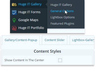
Gallery/content-popup

Content Styles

  • Show Content In The Center

    Select to move the gallery to the center.
wp-image-gallery-general-options-popup-content-styles

Element Styles

  • Image Behavior

    Natural mode will cut the image to fix element box without resizing the image.

  • Element Width

    Sets the width of posted image/video in Gallery Image.

  • Element Height

    Sets the height of posted image/video in Gallery Image.

  • Element Border Width

    Set the border width of the element in Gallery Image.

  • Element Border Color

    Choose the color for the border.

  • Element's Image Overlay Color

    Choose a color for the overlay on the image/video while hovering on it.

  • Element's Image Overlay Opacity

    Set the level of transparency of the image/video overlay.

  • Zoom Image Style

    Changes the color of zoom icon.

Popup Styles

  • Popup Image Full Width

    Select to make image with natural size within popup.

  • Popup Background Color

    Change the background color of popup.

  • Popup Overlay Color

    Choose the color for popup overlay.

  • Popup Overlay Opacity

    Set the level of background transparency.

  • Popup Close Button Style

    Change the color of the icon.

  • Show Separator Lines

    Tick to show separation lines between title and text in popup.

Popup Link Button

  • Show Link Button

    Tick to show link button in popup.

  • Link Button Text

    Change the text of link button in popup.

  • Link Button Font Size

    Change font size of link button in popup.

  • Link Button Font Color

    Change color of link button in popup.

  • Link Button Font Hover Color

    Choose color of link button when hover on it.

  • Link Button Background Color

    Set background color of the link button in popup.

  • Link Button Background Hover Color

    Set background color of the link as you hover on it.

Rating Styles

  • Show Ratings Count

    This option will show how many people rated your project.

  • Ratings Background Color

    Rating has background, decide it's color from here.

  • Ratings Background Color Opacity

    Decide transparency level of rating background.

  • Ratings Font Color

    Rating text font color, can be changed from here.

  • Ratings Rated Font Color

    Color of the rating when rated (active).

  • Like/Dislike Icon Color

    Change color of like/dislike icons.

  • Like/Dislike Rated Icon Color

    Color of like/dislike when it's active ( liked/disliked).

  • Heart Icon Color

    What color would you give to the heart.

  • Heart Rated Icon Color

    Color of the heart when you press on it.

Element Title

  • Element Title Font Size

    Change the size of title font.

  • Element Title Background Color

    Choose the color of title background.

  • Element Title Font Color

    Change the color of title.

Element Link Button

  • Show Link Button On Element

    Tick to show "View More" button on the image.

  • Link Button Text

    Change content of the "View More" text.

  • Link Button Font Size

    Change the size of link button.

  • Link Button Font Color

    Change the color of link font.

  • Link Button Background Color

    Choose color for link background.

Popup Title

  • Popup Title Font Size

    Choose title font size in popup.

  • Popup Title Font Color

    Choose Title font color in popup.

Popup Description

  • Show Description

    Tick to show the description of the image.

  • Description Font Size

    Choose the size of description font.

  • Description Font Color

    Change the color of description text.

Pagination Styles

  • Pagination Font Size

    Change the size of the pagination numbers.

  • Pagination Font Color

    Font color of the pagination can be changed.

  • Pagination Icons Size

    Size of next/prev icon size change from here.

  • Pagination Icons Color

    Change next/prev icon colors.

  • Pagination Position

    Decide where to posit pagination.

Load More Styles

  • Load More Text

    Write another text in Load More button.

  • Load More Position

    Decide where to posit the button.

  • Load More Font Size

    Change font size of the button text.

  • Load More Font Color

    Change the color of the button text.

  • Load More Font Hover Color

    Change the color of the text when you hover a mouse on it.

  • Load More Button Color

    Background color of the button.

  • Load More Background Hover Color

    Background color when a mouse hovered on it.

  • Loading Animation.

    Change the animation type of the loading.

Content slider

Slider Container

  • Main Image Width

    Set the width of the main image in pixels.

  • Slider Background Color

    Set the color of background.

  • Arrow Icons Style

    Set black or white color of arrows in slider.

  • Show Separator Lines

    Click to show the lines between text, title, and link.

Title

  • Title Font Size

    Set the font size of the title.

  • Title Font Color

    Set the color of the font.

Link Button

  • Show Link Button

    Click to show the link button.

  • Link Button Text

    Change the text on link button.

  • Link Button Font Size

    Change the font size of the link text.

  • Link Button Font Color

    Change the color or the link text.

  • Link Button Font Hover Color

    Change the color of the link text while hovering on it.

  • Link Button Background Color

    Choose the color of link background.

  • Link Button Background Hover Color

    Choose the color of link background while hovering on it.

Description

  • Show Description

    Click to show the description of the text.“

  • Description Font Size

    Set the font size of description.

  • Description Font Color

    Set the color of font of description.

Rating Styles

  • Show Ratings Count

    This option will show how many people rated your project.

  • Ratings Background Color

    Rating has background, decide its color from here.

  • Ratings Background Color Opacity

    Decide transparency level of rating background.

  • Ratings Font Color

    Rating text font color, can be changed from here.

  • Ratings Rated Font Color

    Color of the rating when rated (active).

  • Like/Dislike Icon Color

    Change color of like/dislike icons.

  • Like/Dislike Rated Icon Color

    Color of like/dislike when it's active ( liked/disliked).

  • Heart Icon Color

    What color would you give to the heart.

  • Heart Rated Icon Color

    Color of the heart when you press on it.

Lightbox-gallery

Content Styles

  • Show Content In The Center

    Select this to move the content in the center of the the container.

Image / video

  • Image Width

    Set the size of the image / video.

  • Image Border Width

    Set the width of borders.

  • Image Border Color

    Choose the color for the border.

  • Border Radius

    Choose the radius of border corners.

Title

  • Title Font Size

    Set the font size of the title in.

  • Title Font Color

    Set the color of the title.

  • Title Font Hover Color

    Set the color of the title while hovering on it.

  • Title Background Color

    Choose title background color.

  • Title Background Opacity

    Choose the level of title background transparency.

Load More Styles

  • Load More Text

    Write another text in Load More button.

  • Load More Position

    Decide where to posit the button.

  • Load More Font Size

    Change font size of the button text.

  • Load More Font Color

    Change the color of the button text.

  • Load More Font Hover Color

    Change the color of the text when you hover a mouse on it.

  • Load More Button Color

    Set the background color of the button.

  • Load More Background Hover Color

    Set the background color when a mouse hovered on it.

  • Loading Animation

    Change the animation type of the loading.

Pagination Styles

  • Pagination Font Size

    Change the size of the pagination numbers.

  • Pagination Font Color

    Font color of the pagination can be changed.

  • Pagination Icons Size

    Next/prev icon size change from here.

  • Pagination Icons Color

    Change next/prev icon colors.

  • Pagination Position

    Decide where to posit pagination.

Rating Styles

  • Show Ratings Count

    This option will show how many people rated your project.

  • Ratings Background Color

    Rating has background, decide its color from here.

  • Ratings Background Color Opacity

    Decide transparency level of rating background.

  • Ratings Font Color

    Rating text font color, can be changed from here.

  • Ratings Rated Font Color

    Color of the rating when rated.

  • Like/Dislike Icon Color

    Change color of like/dislike icons.

  • Like/Dislike Rated Icon Color

    Color of like/dislike when it's active.

  • Heart Icon Color

    What color would you give to the heart.

  • Heart Rated Icon Color

    Color of the heart when you press on it.

Slider

Slider

  • Image Behaviour

    Choose resized if you need your images to have the size of the slider.

  • Slider Background Color

    Choose the color of background while images has its natural size.

  • Slider Border Size

    Set the size of the slider border.

  • Slider Border Color

    Choose the color for the slider border.

  • Slider Border radius

    Choose the radius for slider border.

Title

  • Title Width

    Choose the width for title box.

  • Title Has Margin

    Click if you need the title to have margin.

  • Title Font Size

    Set the font size of the title.

  • Title Text Color

    Set the color of the title.

  • Title Text Align

    Set the location of the title in the box.

  • Title Background Opacity

    Set the level of background transparency.

  • Title Background Color

    Choose the color of title background.

  • Title Border Size

    Set the size of the title border.

  • Title Border Color

    Choose the color for the title border.

  • Title Border Radius

    Set the radius for border corners.

  • Title Position

    Choose the position for the title.

Description

  • Description Has Margin

    Choose if description need to have margin.

  • Description Font Size

    Set the font size for description.

  • Description Text Color

    Set text color for description.

  • Description Text Align

    Set the location of the description in the box.

  • Description Background Opacity

    Set the level of transparency for background of description.

  • Description Background Color

    Choose the color for description background.

  • Description Border Size

    Set the size for the border in description.

  • Description Border Color

    Set the color of description border.

  • Description Border Radius

    Set the radius of the description box corners.

  • Description Position

    Set the position of description on image.

Rating Styles

  • Show Ratings Count

    This option will show how many people rated your project.

  • Ratings Background Color

    Rating has background, decide its color from here.

  • Ratings Background Color Opacity

    Decide transparency level of rating background.

  • Ratings Font Color

    Rating text font color, can be changed from here.

  • Ratings Rated Font Color

    Color of the rating when rated.

  • Like/Dislike Icon Color

    Change color of like/dislike icons.

  • Like/Dislike Rated Icon Color

    Color of like/dislike when it's active.

  • Heart Icon Color

    What color would you give to the heart.

  • Heart Rated Icon Color

    Color of the heart when you press on it.

Navigation

  • Show Navigation Arrows

    Click to show navigation arrows.

  • Navigation Dots Position / Hide Dots

    Choose the location for dots, or choose to remove them.

  • Navigation Dots Color

    Choose the color for navigation dots in slider.

  • Navigation Active Dot Color

    Choose the color of moving dots in slider.

  • Navigation Type

    Choose one of the navigation arrow types.

Thumbnails View

Container Style

  • Box background

    Set the Color of surrounded box.

  • Box Use shadow

    Click if you need to have shadows in the box.

  • Box padding

    Set the distance between the box and image/video.

  • Box Has background

    Click to have background for thumbnails.

Image/video

  • Video-Image Behavior

    Click to give your image/video a behavior.

  • Video-Image Width

    Set the width of thumbnails.

  • Video-Image Height

    Set the height of thumbnails.

  • Video-Image Border Width

    Set the width of the border between thumbnails.

  • Video-Image Border Color

    Set the color of the border between thumbnails.

  • Border Radius

    Set the radius of the border.

  • Margin Image

    Set the distance between each thumbnails.

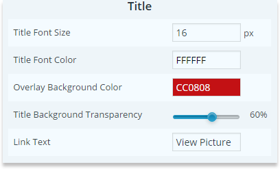
Title

  • Title Font Size

    Set the size of the text font.

  • Title Font Color

    Choose the color of text.

  • Overlay Background Color

    Choose the overlay color of the title.

  • Title Background Opacity

    Set the level of background transparency.

  • Link Text

    Change the text on the overlay.

wp-image-gallery-general-options-thumbnails-title

Pagination Styles

  • Pagination Font Size

    Change the size of the pagination numbers.

  • Pagination Font Color

    Font color of the pagination can be changed.

  • Pagination Icons Size

    Next/prev icon size change from here.

  • Pagination Icons Color

    Change next/prev icon colors.

  • Pagination Position

    Decide where to posit pagination.

Rating Styles

  • Show Ratings Count

    This option will show how many people rated your project.

  • Ratings Background Color

    Rating has background, decide its color from here.

  • Ratings Background Color Opacity

    Decide transparency level of rating background.

  • Ratings Font Color

    Rating text font color, can be changed from here.

  • Ratings Rated Font Color

    Color of the rating when rated.

  • Like/Dislike Icon Color

    Change color of like/dislike icons.

  • Like/Dislike Rated Icon Color

    Color of like/dislike when it's active.

  • Heart Icon Color.

    What color would you give to the heart.

  • Heart Rated Icon Color

    Color of the heart when you press on it.

Load More Styles

  • Load More Text

    Write another text in Load More button.

  • Load More Position

    Decide where to posit the button.

  • Load More Font Size

    Change font size of the button text.

  • Load More Font Color

    Change the color of the button text.

  • Load More Font Hover Color

    Change the color of the text when you hover a mouse on it.

  • Load More Button Color

    Background color of the button.

  • Load More Background Hover Color

    Background color when a mouse hovered on it.

  • Loading Animation

    Change the animation type of the loading.

Justified View

Element Styles

  • Image Height

    Set the height of the images/videos in tape.

  • Image Margin

    Set the distance between each image/video in the tape.

  • Image Justify

    Select to make the width of all image/video up to 100% in container. So all of them together will fit the container of your theme, and tick off to bring each of them with it’s natural size.

  • Image Randomize

    Select to show your images randomly.

  • Opening With Animation

    Choose to see the tape of images/videos appearing animated.

  • Opening Animation Speed

    Set the opening Animation Speed.

Element Title

  • Show Title

    Choose to show the title or not

  • Element Title Font Size

    Choose the font size for the title of the image/video.

  • Element Title Font Color

    Select preferable colour for the title of the image/video.

  • Element Title Background Color

    Choose the colour of title background.

  • Element's Title Overlay Opacity

    Select the level of transparency for the title overlay.

Pagination Styles

  • Pagination Font Size

    Change the size of the pagination numbers.

  • Pagination Font Color

    Font color of the pagination can be changed.

  • Pagination Icons Size

    Next/prev icon size change from here.

  • Pagination Icons Color

    Change next/prev icon colors.

  • Pagination Position

    Decide where to posit pagination.

Rating Styles

  • Show Ratings Count

    This option will show how many people rated your project,

  • Ratings Background Color

    Rating has background, decide its color from here,

  • Ratings Background Color Opacity

    Decide transparency level of rating background,

  • Ratings Font Color

    Rating text font color, can be changed from here,

  • Ratings Rated Font Color

    Color of the rating when rated.

  • Like/Dislike Icon Color

    Change color of like/dislike icons.

  • Like/Dislike Rated Icon Color

    Color of like/dislike when it's active.

  • Heart Icon Color

    Decide what color would you give to the heart.

  • Heart Rated Icon Color

    Choose the color of the heart when you press on it.

Load More Styles

  • Load More Text

    Write another text in Load More button.

  • Load More Position

    Decide where to posit the button.

  • Load More Font Size

    Change font size of the button text.

  • Load More Font Color

    Change the color of the button text.

  • Load More Font Hover Color

    Change the color of the text when you hover a mouse on it.

  • Load More Button Color

    Background color of the button.

  • Load More Background Hover Color

    Background color when a mouse hovered on it.

  • Loading Animation

    Change the animation type of the loading.

Block Styles Gallery

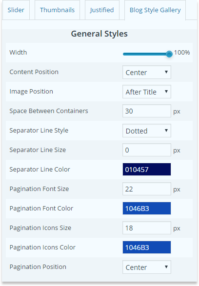
General Styles

  • Width

    Change the width size of the block

  • Content Position

    Decide where to place the content within the page.

  • Image Position

    Choose, where to place your image relatively to title and description text.

  • Space Between Containers

    Set the space between each project.

  • Separator Line Style

    Choose a style for separation line between each item of the gallery.

  • Separator Line Size

    Choose the size for the separation line, which divides gallery among projects.

  • Separator Line Color

    Pick up a color for separational line.

  • Content Per Page

    Decide how many images/videos you need to show per page.

  • Pagination Font Size

    Choose font size for pagination numbers.

  • Pagination Font Color

    Change color for pagination font.

  • Pagination Icons Size

    Decide the size of the icons on pagination.

  • Pagination Icons Color

    Change the color of pagination icons.

  • Pagination Position

    Decide where to place the navigation of pages.
wp-image-gallery-general-options-blog-general-styles

Title Styles

  • Show Title

    Select, if you need to display the title of the project.

  • Font Size

    Choose title font size.

  • Font Color

    Decide font color for the title.

  • Background Color

    Title has background, pick up a color for it

  • Background Opacity

    Adjust title background Transparency level.

  • Text Align

    Choose text align for title.

Description Styles

  • Show Description

    Select whether to see the description text or not.

  • Font Size

    Change the font size for the description.

  • Font Color

    Pick up font color for description text.

  • Background Color

    Change color for description background.

  • Background Opacity

    Adjust description background transparency level.

  • Text Align

    Choose the text align for description.

Pagination Styles

  • Pagination Font Size

    Change the size of the pagination numbers.

  • Pagination Font Color

    Font color of the pagination can be changed.

  • Pagination Icons Size

    Next/prev icon size change from here.

  • Pagination Icons Color

    Change next/prev icon colors.

  • Pagination Position

    Decide where to posit pagination.

Rating Styles

  • Show Ratings Count

    This option will show how many people rated your project.

  • Ratings Background Color

    Rating has background, decide its color from here.

  • Ratings Background Color Opacity

    Decide transparency level of rating background.

  • Ratings Font Color

    Rating text font color, can be changed from here.

  • Ratings Rated Font Color

    Color of the rating when rated.

  • Like/Dislike Icon Color

    Change color of like/dislike icons.

  • Like/Dislike Rated Icon Color

    Color of like/dislike when it's active.

  • Heart Icon Color

    What color would you give to the heart.

  • Heart Rated Icon Color

    Color of the heart when you press on it.

Load More Styles

  • Load More Text

    Write another text in Load More button.

  • Load More Position

    Decide where to posit the button.

  • Load More Font Size

    Change font size of the button text.

  • Load More Font Color

    Change the color of the button text.

  • Load More Font Hover Color

    Change the color of the text when you hover a mouse on it.

  • Load More Button Color

    Background color of the button.

  • Load More Background Hover Color

    Background color when a mouse hovered on it.

  • Loading Animation

    Change the animation type of the loading.

Lightbox Options

Internationalization

  • Lightbox style

    Pick up one of designed styles of ligtbox.

  • Transition type

    Choose the effect of lightbox performance.

  • Opening speed

    From here, configure speed of opening for lightbox.

  • Closing speed

    Configure the speed of closing for lightbox.

  • Show the title

    Tick to display the title of image.

  • Overlay Opacity

    In opened position of lightbox, you can adjust the background overlay transparency level.

  • Auto open

    Tick for automatically opening the first image after reloading.

  • Overlay close

    Tick to close the lightbox by clicking on the background overlay.

  • ESC close

    Tick to close the image with esc button on keyboard.

  • Keyboard navigation

    Tick to slide images in lightbox with left and right buttons.

  • Loop content

    Selection of this option can allow to get to the first image after last image.

  • Show close button

    Choose to display close button or not.

Slideshow Positioning

  • Fixed position

    Tick to fix the ligtbox position while scrolling the page.

  • Popup position

    You are given 9 ways to posit the ligtbox within page.

Dimensions

  • Popup size fix

    Selection of this options will fix the popup width and height.

  • Popup height

    Give the height size to the lightbox.

  • Popup width

    Give width size to the lightbox.

  • Popup max width

    In case of size - unfixed, choose image max width.

  • Popup max height

    In case of size - unfixed, choose image max height.

  • Popup initial height

    Decide the inceptive height of opening.

  • Popup initial width

    Decide the inceptive width of opening.

Slideshow

  • Slideshow

    Tick to enable slideshow.

  • Slideshow interval

    Decide period between slides.

  • Slideshow auto start

    Selection of this option will start slideshow automatically as you open a lightbox. Also there will be "play" and "stop" button for slideshow.

  • Slideshow start button text

    Enter some new text on start button.

  • Slideshow stop button text

    Enter some new text of stop button.